Parking Meters That Prefer Cards Over Coins

More often than not, paying for a parking spot is a tedious affair: either you have to (hope that you) have enough coins on you, or you are confronted with a ticket machine whose designers were led more by the technical constraints inside the machine, than by the requirements of the user standing in front of it.

The experience with the parking meters in San Francisco is quite different: while the meters do accept coins, they also have a slot for pre-paid parking cards, which are available in $20 and $50 varieties.

Card in, observe, card out, done

To pay for your parking spot, you insert the card into the corresponding meter. At first, the display will show the current balance on the card for a few seconds, and then change to show the parking duration.
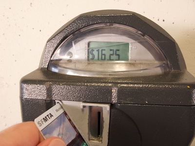
As long as you leave the card in the meter, the parking duration will increase in 7 or 8 minute increments (think “rounded 1/8-hour chunks:” 8, 15, 23, 30, 38, etc). The pace at which this happens is slow enough so you can easily follow along, and yet it is fast enough so you don’t feel like you have to excessively wait for the machine.
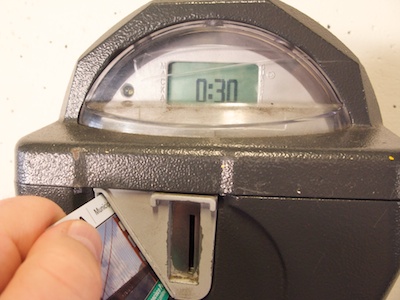
Once the meter displays your desired parking duration, you pull out the card, and you’re done. (On the next photo, note the chip symbol next to the card slot, indicating the orientation in which the card needs to be inserted.)
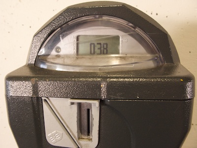
After I had taken the photos for this article, I realized that 38 minutes were not quite enough for what I was planning to do1, so I inserted the card again to see whether I could top up the meter, and it worked just fine.

Also works with parking ticket vending machines

In most cases, a dedicated meter is mounted right next to the corresponding parking spot. In others, you will have to pay at a vending machine, which adds a few extra steps, both in terms of walking up to the machine, as well as using it. Overall, though, this is the simplest and most convenient way to pay for car parking that I have encountered so far.

If you’re going to visit San Francisco and decide you want to buy one of these cards, you can find them at drugstores — I bought mine at the cosmetics(!) counter at a Walgreens — or via mail order directly from the San Francisco Municipal Transportation Authority.

Update 2010-10-07: Lars Feyerabend made an interesting comment about the chip symbol on the parking meter’s front panel:

I think the arrow is ambiguous. Representing the card or does it point to the side of the slot the chip should be at?

My intuitive interpretation of the symbol was that its arrow indicates the side that the chip should be on when inserting the card, i.e., the slot’s “south-western” edge.

Then again, the following picture was taken before the three others shown above, and as you can see, I was about to insert the card with the wrong side up. I had simply ignored the symbol altogether.
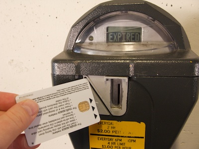
After musing over Lars’ comment, I wonder whether the chip symbol is as helpful for first-time users as I originally assumed. The good news is, though, that the meter will display an error message if you insert the card the wrong way, and does not fail silently.


  1. This being San Francisco, it did, of course, have something to do with eating out, and I hate being rushed when having good food. 

Making Toilet Paper Rolls Easier to Use

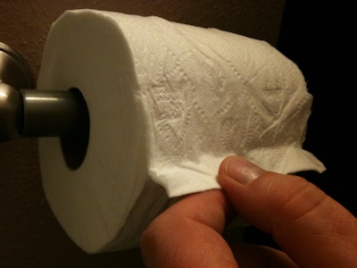
This just in from the Department of Usability Improvements in The Most Unusual Places: the manufacturer of this toilet paper has come up with an ingenious design for indicating where the roll “starts:” at the point where the end of the paper trail is glued on, this roll sports a little fold.

This fold makes it easy to see where the roll starts, and pulling on the fold conveniently breaks the glue bond.

What’s more, the fold can also be easily found by groping around for it. This not only makes it easier to use for the vision-impaired, but also improves its usability when used in one of the enclosed multi-roll dispensers often found in public restrooms.

Paper Towels in Hiding

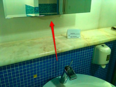
Bath room furniture seems to be many a designer’s favorite playground. If it weren’t, why would so many usability blogs, books, and magazines cover washbowl taps, etc.? Here’s another example: paper towel dispensers in a lounge at Düsseldorf airport.

The paper towel dispenser is located at the bottom of a mirror, but it is very difficult to see the paper towel peek out (see arrow). There is almost no contrast between the color of the towel and that of the paint on the wall, so the towel is not only difficult to see in the image above, but also in real life.

What’s more, when a paper towel gets stuck inside the dispenser box, there is no visual indication as to dispenser’s location.

No wonder, then, that it was necessary to put up the small sign stating that “[p]apertowels can be found underneath the mirror.”2

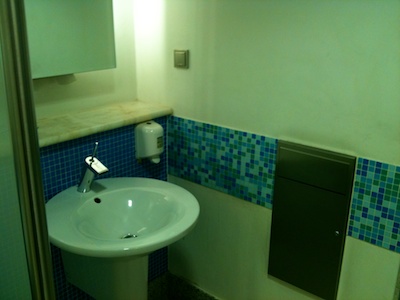
Finding the paper towel dispenser is only the first issue. Having to reach over the washbowl to grab a towel is another: because of the depth of the washbowl as well as the width of its rim, you may inadvertently lean against the bowl with your lap, getting your clothes wet in all the wrong (read: “embarrassing”) places.

Finally, while there is a total of five washbowls along the wall, and every washbowl features a towel dispenser inside its mirror, there are only two trash cans for disposing of used towels. These are nondescript, metal boxes, which are mounted flush into the walls at either end of the row of washbowls.

To identify them for what they are, the users will have to have seen similar trash cans before. A little icon with a hand trashing a paper towel would do wonders here. As would placing the towel dispensers right above the trash can.

If you will allow me the — admittedly somewhat far-fetched — application of the Gestalt Law of Proximity to this design, I would argue that you could split washing your hands into two tasks: actually washing your hands — open water tap, put soap on hands, rub in soap, rinse, shut off water tap — and then drying them — grabbing a paper towel, drying off your hands, disposing of used towel.

When viewed from this perspective, the proximity of the washbowl, the tap, and the soap dispenser are appropriate. But the towel dispenser(s) and the trash can(s) should be associated with each other, instead of the former being associated with the “washing environment” by virtue of its location inside the mirror.

While this kind of “analysis” may be debatable, the merits of this design are not: if you have to provide instructions for something as elementary as (finding) a paper towel dispenser, your design is seriously flawed.


  1. Judging from the sign’s haphazard design, I would bet it was created and put up by someone from the lounge’s staff who was getting tired of having to tell visitors where to find those paper towels…