A Simple and Effective Mechanical Status Indicator

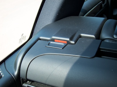
Very high up on my list of things to avoid is being hit in the head by something heavy and rigid flying through the air. Like, say, a car’s trunk cover enclosure, a specimen of which you can see in the photo below.

It’s that pretty hefty bar below the headrests that runs across the full width of the car:

Station wagon's trunk with retracted trunk cover.

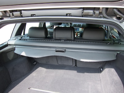
This enclosure houses a (horizontal) trunk cover — to shield whatever’s placed in the trunk from prying eyes — and a (vertical) divider net — to make whatever’s in the trunk stay in the trunk if the driver needs to brake hard.

Thanks to folding rear seats, this car’s cargo area can be extended. When you do so, the cargo cover needs to be mounted in a different location further towards the front of the vehicle.

To that end, the enclosure sports buttons on either side that, when pushed down, will disengage the enclosure from its bracket.

Push button on trunk cover enclosure.

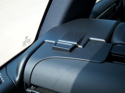
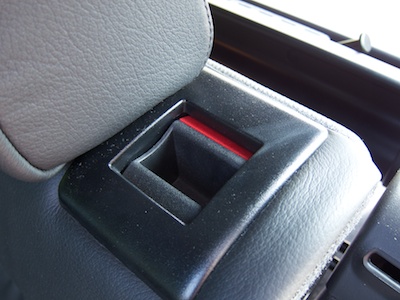
When putting it back into its regular mounting position, it is essential that the enclosure properly snaps back into position in the brackets — lest it morph into that heavy and rigid flying thing mentioned earlier.

A feedback mechanism, literally

Whoever designed this part has come up with an ingenious method to unambiguously notify the user whether she has properly mounted the cover enclosure.

Note the bright red bar on the mounting bracket.

Trunk cover mounting bracket with a red bar on its inside surface.

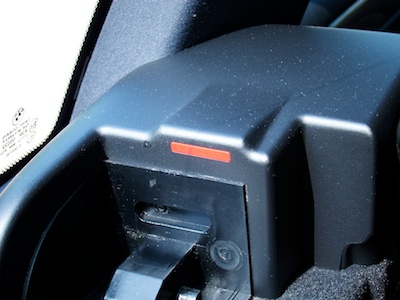
When you press the unlock buttons on the cover, they will remain in the “pushed-in” position. Only when the locks are properly engaged, will they pop out again.

Consequently, the red bar remains visible until you fully push the enclosure into position so that its locks engage and the buttons pop up to cover the red bar.

Push button on trunk cover enclosure. The button is down, revealing the red bar on the enclosure's mounting bracket.

By cleverly utilizing the mechanics of the cover enclosure’s unlock buttons, the designer has created a very simple, very effective status indicator.

And it doesn’t even use electricity!

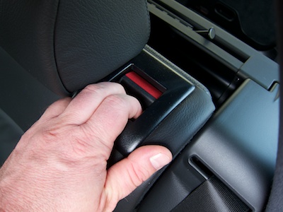
Let’s make it a design pattern!

The same approach is found in the handles for unlocking the folding rear seats: A part of the tumbler handle is colored red, and this part is only visible while the seat back is unlocked.

Handle integrated into the rear seat back in the unlocked position, revealing a red area on the handle.

Push the seat all the way back to engage the lock, and the tumbler handle will move into a position in which the red surface is hidden.

Hand on the rear seat back with two fingers inserted into the unlock handle and pulling the seat back towards the car's front.

Besides the clever status indicators, the seat back unlock handle’s mechanical design is note-worthy, too.

Two interactions for the price of one

Your hand’s natural motion for folding down the seat is to pull the seat back’s top edge towards the front of the car. The seat’s unlock handle is recessed into the top of the seat back, and the surface against which you have to push to operate the handle is the one towards the front.

That is, it lies directly in the path of that natural motion for folding down the seat, so to speak! Therefore, instead of operating the unlock mechanism with one hand and moving the seat back with the other, you place two fingers inside the handle and pull forwards. This one motion first unlocks and then moves the seat back.

IMG folding down rear seat back

Very simple, very effective, just like the “status indicators”.

Sometimes, “Pretty Similar” is Not Similar Enough

My favorite sports news app is Sport1, which is offered by the German TV channel of the same name. Its current version covers eight sports genres like soccer, Formula 1, or U.S. sports.

The app presents these genres, plus four additional functions, as icons on a screen that looks very similar to the standard iOS Springboard for launching applications.

Sport1_MainScreen.jpg

A total of twelve icons is spread out over multiple screens, which can hold up to six icons each. To flip between the screens, you use the familiar horizontal swipe gesture.

The app also lets you re-order these icons, so that you can compile your favorite sports genres onto one screen: As you would in Springboard, to enter editing mode, you tap-and-hold any of the icons until the latter start wiggling.

While in editing mode, you drag the icons around to arrange them. And when you’re done, you tap the “Anordnung speichern” (“Save Arrangement”) button to save your changes.

Sport1_MovingIcon.jpg

As you can see, the Sport1 app very closely mimics both the appearance and the behavior found in Springboard. There are, however, two noticeable differences: In addition to the swipe gesture, the app supports navigation arrows, and icons are automatically re-arranged if you leave any empty spots on a screen.

Turning helpful arrows into sources of confusion

The navigation arrows can be hidden via a checkbox — “Pfeile anzeigen” = “Display arrows” — that appears while the app is in edit mode.

If this option is checked, the arrows appear in the place of a regular genre icon. Unless the app is in editing mode!

While in editing mode, the arrows are always hidden, regardless of the setting for this option. This leads to an annoying problem: If you fill all six spots on a screen, all icons are re-arranged as soon as you leave editing mode to make room for the navigation arrows.

Sport1_SixIconEditBefore.jpg

What you see in the screenshot above will, after exiting editing mode, look like this: The Basketball icon had to move to the next screen to allow the right-arrow to be displayed.

Sport1_SixIconEditAfter.jpg

One way to address this would be to also display the arrows in editing mode. In that case, it would be essential to properly restore the previous icon arrangement when checking and un-checking the arrow option, though.

Every empty seat must be filled

A useful way to arrange app icons on an iOS device is to use “themed” screens. E.g., you could have a screen for games, one for communication apps, one for utilities, etc.

This works just fine, because Springboard won’t “re-flow” all icons to completely fill all spots on a screen. If you wish, you can have just a single icon on a given screen.

Not so in the Sport1 app.

Let’s say, you’re mainly interested in Formula 1, soccer, and U.S. sports1, and you would like to place just these three genres on the app’s main screen. The app does let you configure that arrangement, as you can see here:

Sport1_ThreeIconEditBefore.jpg

As soon as you leave editing mode, however, the app just re-flows all icons so that the three empty spots in the bottom row are now also filled.

Sport1_ThreeIconEditAfter.jpg

Oddly enough, this does not happen when the navigation arrows are active. In that case, the icons are not re-flowed.

Sport1_ThreeIconEditAfterWithArrow.jpg

Why should the decision about whether you would like see those navigation arrows have any impact on how the icons are (re-)arranged? Is this just a bug, maybe?

Mimic, or don’t mimic. There is no “sort-of”.

The icon screen in the Sport1 app re-creates the iOS Springboard’s appearance and basic behavior so closely, that a user can reasonably expect it to work exactly like the “original”.

Expanding and modifying the original’s behavior, however, may confuse users because the way the Sport1 app works differs from what they’ve come to expect based on their experience with the original “role model”, Springboard.


  1. Go Niners! 

Don’t Tell Me What I Don’t Need to Know

This afternoon I was getting some writing done, when, out of nowhere, this dialog box appeared:

A standard OS X dialog box, stating that the application Little Snitch is up to date

At the time, the application that is mentioned in this message was not even running!

Little Snitch is a network utility, and it consists of a “daemon” — a software program without a user interface which runs in the background all the time — and a regular application for configuring the software. It’s the latter that allows checking for updates.

I’m not sure whether a bug caused this dialog box to appear2, but, in any case, it provides a great example for what an application should not bother its users with: Anything that does not require the user’s immediate attention, unless she explicitly requested a piece of information.

Don’t bother me unless it’s important and urgent

What’s it really say in that message? “This application is up-to-date. There’s no need for you to do anything at all about this right now. Just sayin’.”

Although this message was anything but important, it showed up front-and-center on my screen, thus interrupting my workflow, and making me lose my focus and concentration.

Compare this to warnings about my laptop’s battery being low, so that the machine will go into hibernation within a few minutes; or about the machine’s hard drive running out of space, potentially preventing me from saving any more files very soon.

In both of these cases, the computer makes me aware of something that could have a serious impact on my ability to properly use the machine. I must do something about it, and I better be quick.

These kind of critical warnings are annoying, too, but if they didn’t appear, the consequences would go well beyond annoying.

Imagine, however, what it would be like to use a computer that also “warned” you of the fact that everything’s OK! “There is lots of space on your hard drive!” “Your battery is fully charged now!” “There is still enough space on your hard drive!”

Unless you explicitly request a piece of information, e.g., by selecting the Check for Updates menu item, you should never be confronted with a dialog box that merely states that “everything’s fine”. There’d be so many of them, you wouldn’t get any work done at all.

What dialog boxes and secret documents have in common

In a way, well-designed dialog boxes are like confidential documents: They should be presented strictly on a “need-to-know” basis only. If the user doesn’t need to know now, software should just remain quiet.

In cases where there is a need to convey non-critical system status information, status icons or status bars are a much less intrusive and more user-friendly approach.


  1. Automatic update checks were added to Little Snitch in the current version 2.5, which was released only last month. Therefore, it is, indeed, likely that this dialog box’ appearance is a bug.