A Literally Cool Water Bottle

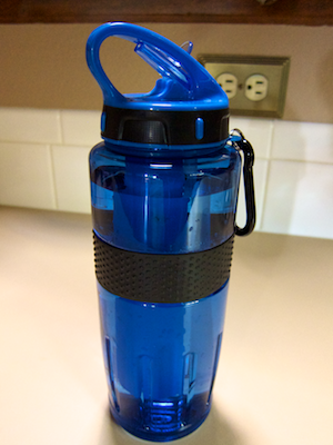
Outdoor-style water bottles are extremely popular in the US. This specimen from Eddie Bauer has a feature that is very cool, and quite literally so: it has a built-in cooling element, the likes of which you find in camping coolers.

Water bottle sitting on a counter top, showing handle loop, closed spout, and carrying shackle

The cooling element is attached to the bottle’s lid with a bayonet lock. By twisting it versus the lid, you can easily remove it for putting it in the freezer.

Disassembled water bottle, consisting of bottle body, screw-on lid with spout, cylindrical cooling element, and breather hose

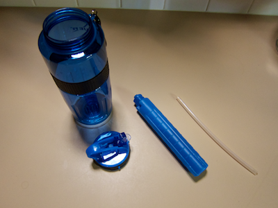
The cooling element is the only part that is not dishwasher-safe. Hence, being able to separate it from the lid also allows placing the latter into the dishwasher.

The bottle sports interesting design details beyond the cooling element, though.

Getting a good grip on the bottle

Depending on the difference in temperature between the bottle’s contents and the outside air, condensation may build up on the outside of the bottle. Its surface is very smooth, so that condensation would make it slippery.

Thanks to a rubber band, you can still get a firm grip on the bottle, so it won’t slip through your hand. A rubber ring laid into the outer surface of the lid serves a similar purpose.

The band provides another function, although I’m not sure whether the designer consciously thought about this one.

When you close the bottle, the cooling element is submerged and displaces some of the water. You need to take this into account when you fill the bottle, of course, so it won’t spill over.

Water bottle filled to just above its rubber anti-slip band

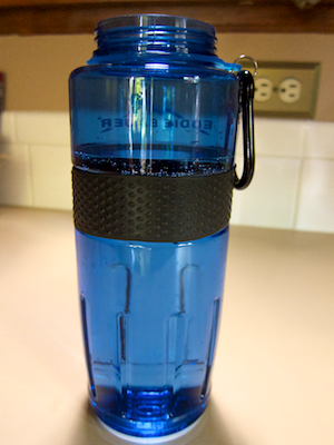
Filling the bottle to just above the top edge of the rubber band provides just enough room so as not to overfill the bottle. In other words, the rubber band also serves as a simple “tank full” indicator. The top-most image shows the water level in the closed bottle after filling it this way.

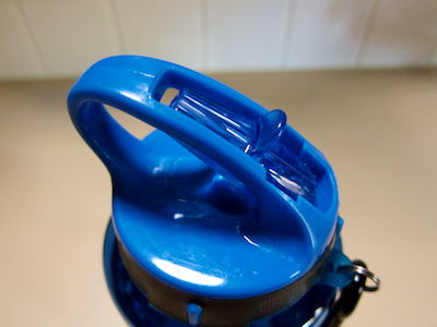
A spout that’s too nifty for its own(er’s) good

The design of the spout is pretty ingenious, too.

Bottle lid with opened spout

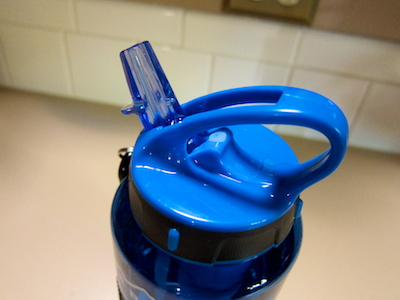
It neatly folds away into the bottle’s handle when closed. In that position, it shuts both the main drinking valve as well as the breather hole.

Bottle with closed spout folding away into cut-out in handle

There is one drawback to this specific design, though: when you carry the bottle by the handle, chances are that your finger will touch the spout’s tip, and move it ever so slightly towards the “open” position. As a result, the bottle may leak, even though it appears to be fully closed.

Finger inside the bottle's handle touches the closed spout

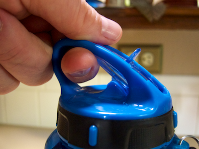
Worse yet, if you take the bottle along into the great outdoors, you will also transfer onto the spout any soil, mud, etc. that you may have on your hands. Next time you take a sip of water, you will ingest whatever’s on the spout’s tip — which is not that pleasant an idea, I’d say.

It is easy prevent the finger from touching the spout by slightly redesigning the shape of the finger loop, as seen here:

Design for a water bottle spout that features a thin plastic barrier between finger loop and spout

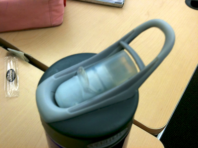
This bottle has an additional spout cover, so its opening/closing mechanism isn’t quite as evolved. Both the cover and the little plastic barrier effectively prevent you from inadvertently touching the spout while carrying the bottle.

A “We’re Closed Today” Notification With a Few Gaps

A few days ago, I walked to my nearest post office branch to send out some packages. Surprisingly, and disappointingly, they were closed. This poster, affixed to the main door, explained why:

Poster mounted on a door, stating that the post office is closed for the day

The text on the poster reads:

Closed on 25 October 2011

Unfortunately, we cannot be at your service on 25 October 2011 due to a company meeting as provided for in the [German] industrial relations law ([reference to section of the law]).

Basic Postbank services (e.g., withdrawal of cash) in the near vicinity:

[addresses of three other branches]

Hoping that the temporary closure was limited to this specific branch, I headed over to the main post office near the city center — only to find the same poster there, as well.

After I had wasted more than an hour hauling my packages around town, I couldn’t help but wonder how a better-designed version of the poster could have saved me time, effort, and good mood.

Inform me about what’s going on, but make it precise

The text on the poster is very exact about explaining the reason for the closure, but it fails to explain the closure’s scope. It would have required just a few more words to make this clearer:

Due to an all-hands company meeting, all mail offices in Aachen will be closed on 25 October 2011. We regret that we cannot be of service to you on that day.

Inform me about possible alternatives

Listing three branches that are open and provide at least some services, is helpful. There is a caveat, though: These are not full-service mail offices, but so-called “Partner-Filialen”, i.e. “partner agencies”.

In most cases, what you will find in these locations are Deutsche Post-branded service counters inside regular shops like supermarkets, newsstands, etc. The poster, however, bears the Postbank logo and explicitly refers to “Basic Postbank services (e.g., withdrawal of cash)”.

What if I need to change an insurance contract? Is that service available in any of those three locations? And what about mail services: can I send my packages from there?

Not knowing exactly where which services are available makes it unnecessarily difficult to decide which of the “partner agencies” to go to. Much more so, since, despite the phrase “in the near vicinity”, neither of the three shops is closer than a brisk 20 minutes’ walk from where I saw the poster!

Ideally, the poster would have provided bulleted lists of all services available at the respective partner agency. And Deutsche Post already does have that information in a database, as evidenced by their online branch finder.

Inform me in a context that is useful to me

This branch finder on Deutsche Post’s website displays both full-service branches as well as partner agencies on a map. Clicking on a location brings up a window with opening times, available services, etc.

Map view of Post's online branch finder, displaying a branch's details like opening times, etc.,

And yet, before I headed out the door with my packages, I had checked the opening times for my nearest as well as the main post office branches via that web page. But there was no mention whatsoever that these would be closed for the day.

What is the point of listing opening times if a branch is not open at all?

It baffles the mind why no-one at Deutsche Post had thought of adding this essential-for-the-customer-experience piece of information to their website.

Error messages: Like digital, like analog

In a way, you can think of this poster as an “error message in the analog domain”. As such, the same key guidelines that apply to its digital counterpart should apply to the poster, as well:

  • Explain what happened, why it happened, and what the user/visitor/customer can do to fix the problem
  • Write the message’s contents so they’re meaningful to the user
  • Provide the message in the appropriate context

Deutsche Post’s poster feels like a — fictitious, mind you… — error message in Microsoft Word that says “Could not save your most recent document. Try some other word processor. [OK]”, and which appears right after you quit the application.

That said, Deutsche Post’s user-friendly online branch finder shows that they’re on the right track. So, hopefully, next time they shut down every post office in my hometown for a full day of “betriebsverfassungrechtlich vorgesehene Betriebsversammlung”, I’ll be able to find out about it well before leaving my house.

Pick Your Type of List Selection Wisely

Among the well-established user interface controls are checkboxes and radio buttons for making selections from a list. With “well-established” I mean that users (tend to) have a common understanding of what checkboxes and radio buttons look like, and how they behave.

A preferences panel from Late Night Software's Script Debugger, showing checkboxes and radio buttons to select options

The difference in behavior between checkboxes and radio buttons lies in how many items you can select at a time.

A list of checkboxes allows you to select items arbitrarily: When clicking one checkbox, this has no effect on any other checkbox within the same list. You can check none, some, or all of the items.

Radio buttons, just like their namesake, let you select exactly one item at a time. Clicking on a radio button unselects the previous selection, and there always is an initial selection.1

Interestingly, there is no well-established UI control yet that requires you to select at least one or more list items (vs. zero or more for checkboxes).

In some cases, designers do have to find a workaround for this problem. More often than not, though, there is no actual need for the one-or-more approach to start with. Here’s an example for the latter.

America’s latest premium TV channel: “None of the Above”

Across the US, TV programming differs slightly between regions and providers. Most websites that offer TV listings let you configure their schedule accordingly. On the TV Guide website, for example, you do so by filling out a simple four-step questionnaire.

Form from the TV Guide website for selecting your location and TV provider in four steps

In the final step of this process, you select any premium channels you subscribe to via a list of checkboxes. The odd thing about this design is the bottom-most option: “None of the Above”.

https://uiobservatory.com/media/2011/ListSelectionTVGuide.png” alt=”Fourth step of TV Guide form, showing a checkbox list of premium TV channels plus an option for “None of the Above”” border=”1″ width=”400″ height=”232″ />

Its appearance is perfectly identical to the other list items, which usually means that it should also behave identically, and control the same kind of functionality.

Nevertheless, if you do click this checkbox, any selections you may have made from this list are cleared, so that “None” is the only selection. Un-checking it again, however, does not restore your previous selections.

Because this option visually blends in with the others, it is also easy to overlook. If you do, and make the “mistake” of not checking any of the options, an error message appears, requesting you to “Please select at least one of the options”.

Error dialog box stating to select at least one option from the premium TV channels checkbox list.

Unless you had discovered the “None” option and understood its meaning at this point, seeing those instructions may confuse you: “But I haven’t subscribed to any premium channels. Why, then, should I have to select one?!”

There are several ways to make this process more user-friendly, like making the “None” option stand out visually, by rephrasing the error message to make it easier to understand, etc.

When “None of the Above” should not be an option

The easiest solution in this case, though, is to simply remove the “None” option altogether. Not checking any of the available premium channels already constitutes the common understanding of “Nope, don’t have any of these!”.

Generally speaking, there are cases in which it does make sense to include a “None” option — namely for radio buttons! For checkboxes, however, the status of all checkboxes being unchecked perfectly covers the “None of these” option already.


  1. No matter how many web designers very obviously think otherwise, displaying a group of radio buttons without any selection is bad design. By definition, a radio button has an initial selection.

    If there is none, you have to guess whether whether you are expected to make a selection, or whether it is OK to leave it as is. Also, you cannot easily revert the radio buttons to their initial indeterminate state.

    The easy fix for an indeterminate group of radio buttons is to add another option labeled “None [of these]”, and select this as the default.