Web Map Searches in Mobile Safari

Mobile Safari currently supports three search engines, Google, Yahoo!, and Bing. All three of these present their search results on web pages that have been optimized for viewing on mobile devices. Also, all three can show search results on a map. The are differences in how easy these maps can be navigated, however.

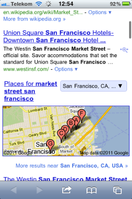
For testing, I used the search term “market street san francisco,” which has two interesting characteristics: first, the search engines should easily recognize this as a geographical location, namely Market Street in SF; and second, there is a good chance of also finding businesses that refer to Market Street in their name, or that are simply located along that road.

Here’s what I — quite literally — found.1

Google

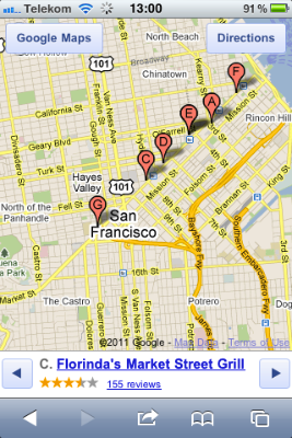
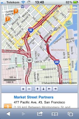
Discovering the map: A map preview appears directly on the search results page. It’s just below the fold on an iPhone and shows a number of location markers.

The frame around the map has the same color as standard Google text links, indicating that the map itself is tappable.

MobileSafariGoogleSearchResults

Navigating the map: You move the map around via tap-and-drag. Double-tapping zooms into the map by a fixed ratio, and the pinching/spreading gestures zoom out of, and into, the map, respectively.

MobileSafariGoogleMapView

While these interactions may be difficult to discover because they are invisible, they do follow the standards defined by the Photos and Maps apps.

Finding search results on the map: Information about the locations that are marked, appears below the map.

If there are multiple search results, you can step through them with left/right buttons. When you do so, the map is automatically re-centered around the selected result. This also works the other way ’round: tap a location marker, and the information below the map will change to the corresponding location. All of this works without the map page being reloaded.

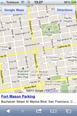
One detail I miss is a dedicated “Re-center” button to get back to your marked location in case you moved the map so far that the marker ended up off-screen. As a workaround for a search with multiple results, you can step to the next result, and then right back to the previous one, to find that location again. This won’t work for single search results, however, as you can see here:

MobileSafariGoogleMapViewSingle

Noteworthy details: The two buttons in the top corners of the map open the currently selected location in the “Search” and “Directions” views in Maps, respectively. In the case of “Directions,” the location is entered into the “End:” field for quickly looking up the route to get there.

Yahoo!

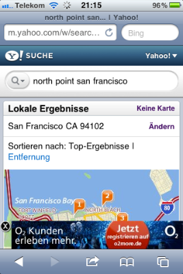
Discovering the map: The search results on Yahoo! include “local results” (“Lokale Ergebnisse”), but these are not displayed on a map (pre)view. To show the results on a map, you have to click a “Map” (“Karte”) link in the “local result” section’s header.

MobileSafariYahooSearchResults

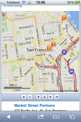
Navigating the map: Yahoo! uses static images for the map, and displays it on a scrollable page.

To zoom in or out, or to move it, you have to tap on one of six buttons shown below the map. The only gesture you can use on the map is double-tapping, which will vertically center the map on the screen.

MobileSafariYahooMapView

The map’s navigation buttons are tiny. Although there is ample horizontal room on that button bar, the designer chose square buttons over wider, rectangular ones that would be easier to hit. There is hardly any room between the buttons, either.

The page is reloaded every time you move or zoom the map. Unfortunately, the vertical scroll position of the page may shift slightly between reloads. E.g., when I tapped the down arrow on this screen…

MobileSafariYahooMapShift1

… the map’s position moved slightly upwards after loading the new map image:

MobileSafariYahooMapShift2

Finding search results on the map: The list of search results is displayed below the map. Markers on the map show their corresponding locations.

There are no links between the two, though, so you have to manually correlate the list items with their respective location markers.

The page lists up to ten search results at a time. On the small screen of an iPhone or iPod touch, this means you will likely need to scroll back and forth quite often to fully grasp which map location belongs to which description.

Noteworthy details: Sometimes, Yahoo! will display ads as overlays at the bottom of the map page. These hide automatically while you are scrolling, but still feel more intrusive than the ones that Google sometimes displays right on the map.

MobileSafariYahooAdOverlay

Bing

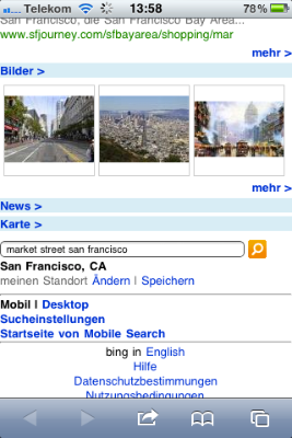
Discovering the map: Bing displayed the shortest results list by far, with only two webpage links and three images. A map may also show up on the results page, unless the location it found extends over multiple ZIP code regions.

MobileSafariBingSearchResults

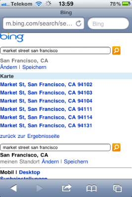
In that case, you only see a “Map” (“Karte”) text link, which takes you to a list of ZIP codes.

MobileSafariBingZipCodes

Imagine being in an unfamiliar city and running a web search similar to “market street san francisco.” Would you feel comfortable picking a neighborhood of that city to limit your search on, based only on a ZIP code?

I think that filtering a geographical search should happen via selecting a region in a map view, but not before you have even seen that map for the first time.

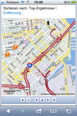
Navigating the map: The way in which Bing displays the map is similar to Yahoo!’s: the map itself is a static image on a scrollable page, buttons are used for zooming and moving the map, and (single-)tapping the map image centers the page.

It reloads the page to update the map image, and it also shares the flaw of not preserving the vertical scroll position between such reloads.

MobileSafariBingMapView

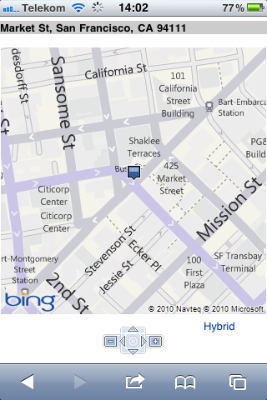
The buttons below the Bing map are even smaller than Yahoo!’s, and are placed even closer together. The location of the zoom buttons — one each to the left and right of the “cursor” buttons — is unfortunate, because it breaks up proper grouping of the controls for zooming and navigation. (Yahoo! gets this right.)

I do like the arrangement of the navigation buttons in a compass dial for its natural mapping. This one even features a “re-center around location marker” button at its center, whose functionality neither Google nor Yahoo! offer.

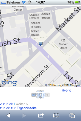
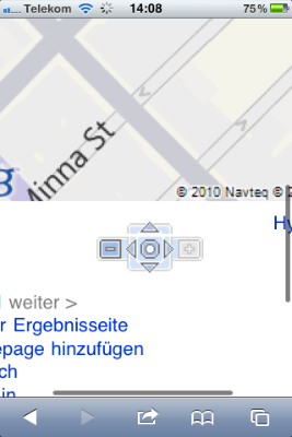
What I don’t understand is why the entire assembly isn’t at least twice as big. As you can see in the following screenshot, the reason for this design is not a lack of available space.

MobileSafariBingMapViewButtonSpace

Finding search results on the map: Interestingly, Bing comes up with much fewer search results overall. For “market street san francisco,” it only found the actual street, but none of the results — retail stores, hotels, etc. — that Google or Yahoo! found.

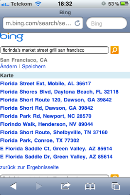
Some searches found a single correct match each, while other perfectly reasonable search terms like “apple store san francisco” or “cha am restaurant san francisco” came up empty. Yet other searches like “florinda’s market street grill san francisco” (as found by Google earlier) made Bing deliver “matches” that are surprisingly out of line:

MobileSafariBingFlorindaSearch

Noteworthy details: The results page itself is somewhat zoomable, i.e., its width is not fixed to that of the screen. When I first tried the spread gesture on the Bing map, I initially thought I could zoom the actual map this way, until I realized that I had zoomed the entire page.

MobileSafariBingZoomedPage

Show me the way, Google!

In general, using buttons for zooming and moving a map might work almost just as well as direct manipulation — albeit with a much smaller dose of “touch-screen magic.” The way that this approach has been implemented by Yahoo! and Bing, however, is plagued by a number of flaws.

The buttons are too small, their spacing is too narrow, reloading the page for every zoom or move operation feels disruptive, and manually correlating location markers with particular search results is tedious.

Google’s direct-manipulation map is not only more intuitive and more convenient to use. It also makes great use of the available screen real-estate, displaying all related data in a single screen-full that does not require any scrolling.

Being able to move and zoom the map without reloading the page gives you a great sense of direction: you can easily see where you are “going” while dragging the map’s contents around.

In short, despite being “optimized for mobile,” Bing’s and Yahoo!’s map web pages still feel like, well, web pages. In comparison, Google’s map feels like a veritable application: if it weren’t for the browser chrome, you might think that it’s a native iOS app.


  1. I was in Germany while testing this, so the look as well as the contents of the search results may differ from what you get in your own locale. 

One Weird Search Box

When I recently followed a link from a tweet, I ended up on the Display Blog, a weblog dedicated to the display technology business.

The site’s super-simple appearance immediately appealed to me. There is nothing on the page that can distract you from actually concentrating on reading the blog’s articles.

DisplayblogMainPage

Page navigation is simple, too: there’s a title banner linking back to the site’s entry page, and the standard pair of Previous Entries/Next Entries links. That’s it. No chronological archive, no tags, no keywords, no blog roll, …

Wonderful!

There is an unusual one-line “instruction” right beneath the title banner, though, according to which you can also search the site. The way to do so sounds almost magical:

To search, type and hit enter

To see if that would actually work, I followed these instructions in the most literal way: I just started typing a few letters, and hit the Enter key.

Nothing happened.

That’s, of course, because you first have to click on that very line of text to activate a search box which is hiding in the same location.

DisplayblogSearchField

Now, when you type, you can also see what you type, and hitting enter does bring up a page with search results.

Analog or digital: simple things should not require instructions

Within the realm of websites, a search box is a “simple thing.”

Average users have a basic understanding of how to perform a search on a website. At least, as long as the search field is easy to find, provides sufficient visual cues that say “I’m a search field!,” and operate in a standard manner.

The only reason why “instructions” are required on the Display Blog page is simply this: it’s because the search field does not look like a search field.

It’s just a small box drawn in a line that is so thin and light, you can hardly see it at all in the top-most screenshot above. It does not have a “Search:” label, it does not display a loupe icon, it lacks the inset shadow that has become fairly common for text entry fields, there is no button labeled “Search” — nothing about the search box itself says “I’m a search box!”

Even worse, the instructions that are provided, are incorrect since they omit the very first step in the process, namely “click here.”

If it ain’t broken…

The easiest way to fix this search box is to simply use a standard design. And that design does not even have to look dull or lack more extensive features. Just have a look at this search box on Lukas Mathis’ blog, Ignore the Code.

IgnoreTheCodeSearch

It looks like a standard OS X Aqua-style search box, has a cancel button, and a menu with search history. And yet it is easy to find even for non-Mac users, because its label explicitly states what it is: “Search.”

There is an equivalent to “if it ain’t broken, don’t try to fix it” in user interface design, and its essence is:

If users are familiar with a de facto standard way to use a certain feature, stick with that standard in your own designs.

If you break this rule, you will most likely create unnecessary usability problems like the ones I ran into with this search box on the Display Blog.

A Radio Alarm Clock Designed Specifically for Hotel Rooms

Hotels in large cities make for excellent UI observations, because these places serve as temporary homes for international visitors with diverse cultural backgrounds. It is a challenge for any designer to ensure that all of these guests will be able to easily understand and properly use the hotel’s facilities, like door handles, make-up mirrors, and elevator control panels.

Another category of devices regularly found in hotels are radio alarm clocks. This article is about one such clock that was specifically designed for use in guest rooms.

Hilton radio alarm clock on a hotel room nightstand

When I saw this alarm clock during a recent stay at a hotel, I vaguely remembered that it had been announced to much fanfare a few years ago. A quick online search revealed that the device was custom-designed for Hilton hotels group, and when it was introduced in 2005, the press release hailed it as the radio with the “World’s Easiest-to-Set Alarm Features:”

The new Hilton Family clock houses a sleek design and simple digital alarm interface for buzzer, radio wake-up and snooze. The simple-to-set alarm feature requires just three easy steps (also printed on the front of the clock): 1. Press Alarm Set; 2. Indicate Alarm Time preferred by using increase or decrease buttons; 3. Press Enter.

Kudos to Hilton for leveraging user-friendliness as a customer benefit, and also for creating public awareness for this aspect of the user experience!

What is so special about this clock?

The most obvious difference between this radio alarm clock and other similar devices are the explicit instructions on how to set the alarm time, which are printed right onto the front panel. All related buttons on the front panel have numbers printed on them to link them to the respective steps in the instructions.

The front panel of the clock with display, control buttons, and printed-on instructions

To set the alarm you press the ALARM SET button; adjust the time via the ALARM TIME forward and backward buttons; optionally choose a radio station via the picture buttons on top of the device; and finally press the ENTER button.

Radio station presets and snooze button on top of the clock

Pressing ENTER activates the alarm and sets the alarm type to “Radio Alm” or “Buzzer Alm,” depending on whether you pressed a radio station button, or not.

The combination of a simplified adjustment process; the explicit, “non-lose-able” instructions right on the device; and the numbers on the buttons to help find the required controls for each step, not only make the actual adjustment much easier than on other clocks. They also make it much easier to discover how that adjustment is performed.

A suggestion for making an easy-to-use device even easier-to-use

When I played around with the clock, I found the layout of the controls a bit impractical, what with the buttons being scattered all over the front panel.

Additionally, due to the buttons’ shapes and positions, some of them are visually grouped even though they are not related, e.g., the two ALARM TIME and the two RADIO TUNE buttons at the front panel’s center.

I also noticed a real design flaw: despite its label, the ALARM OFF button does not always switch off the alarm. Rather, it cycles through the three alarm types, radio, buzzer, and off. If you press the button with the intent to deactivate the alarm, you may just change it from radio to buzzer, instead.

In other words, in some situations, the result of pressing the ALARM OFF button is neither what you would expect, nor what you intend it to be. A simple fix would be to change the label to “ALARM MODE.” An even more user-friendly and more reliable design approach is to provide three distinct buttons, one for each alarm mode.

Don’t make me go modal

Speaking of modes, setting the alarm on this clock is, in fact, modal: pressing the ALARM SET button enters the mode, pressing ENTER leaves it. I doubt that there is an actual need for this mode.

If there were three separate buttons in place for selecting the desired alarm mode, it would suffice to let the user set the alarm time by pressing the backward or forward buttons.

Even more so since this clock always displays both current and alarm time, so that both are always visible to the user; there is no need to enter any mode to check the currently set alarm time.

The two keys change the alarm time by a minute per keypress, unless you hold them down, in which case the time is advanced automatically. Still, the risk of accidentally modifying the alarm time by more than just a few minutes is reasonably small.

Small enough, I would say, that the benefits of the quicker access to modifying the alarm time outweighs the risks of inadvertently changing the time by a non-trivial amount.

After swapping out the ALARM OFF button for three distinct mode buttons, and removing the mode for setting the alarm time, the next step would be to change the layout of the front panel so that both controls and instructions are grouped more closely. Consequently, the need to link instructions and buttons via numbers no longer applies.

Rough sketch with a redesign of the clock's front panel

The alarm type selection is displayed right above the respective mode button in plain text. An additional LED above each of these buttons could provide even better feedback, but such bright status lights may be bothersome to guests who are such light sleepers that they require a totally dark room in order to find good sleep. Hence, the status indicator for the alarm type remains on the clock’s LCD.

The alarm time buttons are shaped as minus and plus signs. Besides the prominent visual cue this also provides tactile feedback. As for the buttons’ position, even though they are not directly adjacent to the display anymore, they do align vertically with the alarm time on the display.

As a welcome side effect, this modified layout opens up some space below the alarm controls, adding a clear distinction between alarm and radio controls. The shapes of the radio sections on/off, volume, and tune buttons all differ, adding yet more visual as well as tactile differentiation.

What Donald Norman thinks of this device

When, halfway into writing this article, I did some further online research on this device, I saw that Donald Norman had also commented on this clock.

In response to his initial unabashed enthusiasm about the clock, readers of his site wrote in to point out several flaws in the device.2

Among these flaws is the erratic behavior of the ALARM OFF button, for which Norman suggests the same fix that I have outlined above: use three separate buttons for each of the three alarm modes.

A problem I had not encountered, because I played around with the clock during the day, is that you cannot read the control’s labels in the dark. I would assume that this could be addressed by using fluorescent paint for the button labels or a back-lit front panel.

Finally, another reader complained that setting the alarm time with just two buttons would be “terribly awkward,” to which Norman replies:

Holding either button down increments the time at the rate of two minutes per second. If the button is held down for 5 seconds, the setting time then increments at the rate of 10 minutes per second: it this[sic!] increments an hour in six seconds. This is slow enough to stop close to the desired setting, yet fast enough not to be a burden.

While I had not measured the clock’s hold-down time-outs and advance speeds this meticulously, I did not feel that setting the clock was tedious. The handling was swift enough to set the clock fairly easily, while still making it sufficiently precise to stop its advance when approaching the target time.

As for changing the alarm time inadvertently, Norman considers the corresponding mode a good thing:

Many clocks have this failing [of making it too easy to change the alarm setting], allowing a single button press to change the time or alarm setting. As a result, a single button error changes the setting, and in a device meant to be used by sleepy people, in the dark, errors of this sort are guaranteed. Better clocks require simultaneous depressing of an “Alarm Set” button to change the alarm time, thereby eliminating accidents. (The Hilton clock requires the clock to be in “Alarm Set Mode” which solves the problem.)

On the risk of sounding conceited, I disagree with Norman on this point. As I have outlined already, quickly brushing against either of the alarm set buttons will change the time by only a handful of minutes, which should not have too much of an impact on a guest’s risk of missing their flight, business meeting, or dinner date.

Having to press another button in addition to the actual time set buttons, however, is awkward, and it also potentially creates accessibility problems.

Notwithstanding the room for improvement in the current design, it is a great move for a major corporation like Hilton hotels group to even address usability on such a scale, with such public awareness, and with a product that does deliver on its promise of easier-than-usual user-friendliness.

A virtually silent postscript

Unfortunately, the radio section of the clock in our room did not work. Pressing “Radio On/Off” or any of the genre buttons did not do anything, so I could not test that functionality.

Interestingly, though, when I followed the process for setting the “radio alarm” for testing, the device would fall back to buzzer alarm. Interesting.

Update 2011-03-17: Via email, Lars Feyerabend chimed in to share his opinions about this clock.

Agreeing that the “Set Alarm” mode is not necessary, he goes on to say:

[T]hey should rather make those “Radio alarm buttons” on the top of a device mechanical toggle buttons like they had back in the days. They stay “pressed” to signal their state, but when you press another button, every other button gets de-pressed.

Lars points out an important aspect that I hadn’t addressed: the radio genre buttons on top of the device do not indicate the current selection.

Since, as I had mentioned in the postscript, the radio in our alarm clock did not work, I could not check whether the selected genre is displayed on the clock’s LCD screen. If not, the buttons could be equipped with LEDs or lighted rings, or implemented as mechanized buttons as per Lars’ suggestion.

And the Alarm Off cycle confusion and “alm” display could be taken care of with a simple hardware slider. Three positions: Off, Buzzer, Radio.

Compared to positioning your finger over a button and pressing it, “targeting” the center position of a hardware slider requires more motor precision. This potentially makes it awkward to use, especially for older users.

What’s more, with a three-position slider, you will always activate — however briefly — the center setting when moving between the two outer positions. Assume the positions from left to right are “Off,” “Buzzer,” and “Radio”. If you selected radio alarm, and the radio just started playing to wake you up, you probably don’t want to make the obnoxiously-sounding alarm buzzer go off when moving the slider to the “off” position to silence the radio.

There is a consensus, however, that three distinct physical controls — or three physically different positions on a single control — for selecting the alarm mode will work better than the current single button that cycles through the modes.

When selecting the radio [alarm type], the buttons on top might even light up briefly to signal the additional choice. In “Off” position the alarm time would be hidden from the display.

While I am not sure whether users would find it confusing if the alarm time vanished from the display, or not, I really like the idea of the genre buttons lighting up on top of the clock to guide the user to these additional controls.

And last, but not least, I’d replace those pesky +/- buttons with rotary controls. Endless and “push-to-change” for time adjustment and regular, bounded ones for radio tune and volume.

I could see the use of rotary dials for setting the volume, and maybe for radio tuning. For setting the clock, though, I’m skeptical whether this would be a good choice.

I’ve used a few clocks that had a single rotary dial for adjusting the time. Rotating them would adjust the minutes, and the hours would roll over as if you were setting an analog clock.

The problem with this approach is that the dials either work too slowly, so that many turns are required, or they are overly sensitive and operate so fast that setting the time with precision becomes a major challenge.

If dials were used for this control purpose, the clock would probably require two separate ones for hours and minutes.

In an amusing coincidence, Donald Norman has also written about the Hilton radio alarm clock again recently. Stating that the clocks often fail to display the correct time, and that it is virtually impossible for hotel guests to adjust them properly, he makes this suggestion:

Meanwhile, if you want a good alarm clock, carry your own. I highly recommend the clocks on modern smart phones which take advantage of their numerical keypads and large, attractive displays.

For setting highly structured data fields like the time, numerical keypads create their own set of usability problems. If you have seen someone struggle with typing in the time via a keypad, and never being really sure which digit is currently being set, you will know what I mean.

In the end, Norman tells Hilton to “Try again. This one was a nice try. Time for a new, improved version.”

I agree: Hilton’s efforts are commendable, even though the end result still leaves room for improvement. I do hope they will come up with a version 2 of this clock. And I can’t wait to see whether it will feature up/down buttons, radial dials, or a keypad for adjusting the alarm time, and whether that process will still be modal.


  1. I will skip the point about not being able to adjust the clock’s regular time due to it being radio controlled. I simply don’t find that aspect particularly interesting. Apologies.