How One Extra Feature Reduces a Hotel Safe’s Usability

When staying at hotels, in-room strongboxes provide safe and convenient storage for valuable electronics like laptops and cameras. All you need to do to lock away your precious geek gear is to place it in the strongbox, close the door, and type in a four-digit code.

Type in the same code to unlock the strongbox, and that’s all there is to it. Or is it?

Typing in your code

Here’s the safe I found in my room while staying in Munich for the fabulous IA Konferenz last May.

Front view of a hotel safe

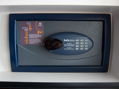
A four-digit LED display and a number pad are its only user controls.1 They are located on the device’s front panel. Concise instructions on how to use the safe are printed between the two.

Close up of the hotel safe's keypad and display

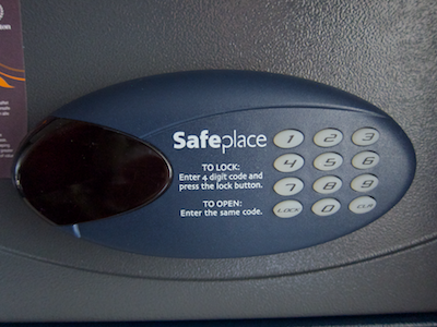
When you press any of the keys, the entire keypad lights up, so you can easily use the safe even if it has been mounted in a tight, dark closet compartment, or under dim lighting.

The number corresponding to the selected key appears in the display, whose number segments are bright enough to also be readable in less-then-ideal lighting conditions.

Typing a key on the safe's backlighted keypad

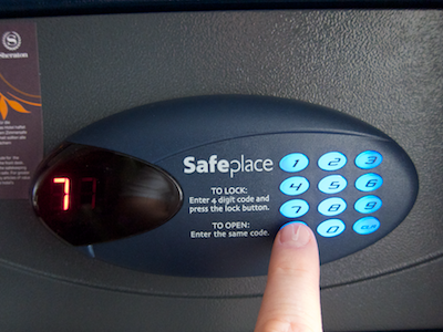
Every keypress is accompanied by a short beep, with each key’s beep having its own pitch. This may help visually impaired users with remembering and re-entering their code.

The “5” key at the center of the keypad features two small tactile “spikes” on its surface, which make it easier to navigate the keypad by touch alone.

Unfortunately, the designers of this safe decided to implement a very short time-out for entering the code: if you pause for a mere 2 or 3 seconds, the display goes dark, the keypad’s backlighting is switched off, and you have to start over.

Although the vast majority of time-outs constitute serious design flaws, this specific one does make sense, because it helps reduce the safe’s energy consumption by switching off the display and keypad backlighting. Its duration is simply too short, however: The user should have more time for entering the code than just a few seconds.

Your valuables under lock and key

To close the safe, you shut its door, type in an arbitrary four-digit code, and press the LOCK key. You then hear the lock bolt move into position, accompanied by an “animation” in the LED display, and followed by a mildly annoying confirmation melody.

Finally, “Clsd” appears in the display, followed for a few seconds by the lock code. Seeing the lock code one more time is a very welcome opportunity to confirm that what you had entered is, indeed, what you thought you had entered.

To unlock the safe, you just type in your code again. The safe is unlocked immediately after you enter the code’s fourth digit, unless you made a mistake.

Although it is not mentioned in the instructions, the CLR key clears your recent entry so you can start over if you made a mistake. It is, however, possible to operate the safe without ever using this key. Ironically, it’s the short time-out that makes this possible.

You did it wrong!

The safe is a bit less user-friendly if you do make a mistake: Enter fewer than four digits before pressing the LOCK key, and “Er04” is displayed, and a not-so-mildly annoying error beep is played.

Since I did not encounter any other numbered errors, I wonder why the designers included the somewhat confusing number instead of displaying a plain “Err” message.

In case you enter an incorrect code, the safe responds be displaying “Code” and playing an error beep.

While I’m on the subject of the display: Interestingly, the mapping of the animation on that display, which represents the lock bolt moving inside the safe door, is reversed in this specific device.

In basically every door, the lock bolt is located opposite from the door’s hinges so that, when the door is locked, the bolt moves away from the hinges. On this safe, however, the animation moves towards the hinges (which are mounted at the left edge of the safe’s door) when it locks.

Apart from these two criticisms — numbered error code and animation mapping –, the only other idea I thought of while observing this device is to set the “LOCK” and “CLR” keys apart from the number pad and/or color them differently, so as to make them stand out more visually.

One socket to charge them

But there’s one more thing! And a seriously cool thing at that: this safe is equipped with an internal power outlet.

A standard (European) power socket mounted inside the hotel safe

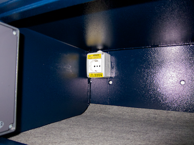
Thanks to this brilliant feature, you can charge your laptop while it is safely stowed away inside the strongbox. It’s one of those rather rare “I wish you’d see this everywhere!” ideas.

Works just as advertised

A hotel safe is a fairly simple device, and the specimen from Munich is as easy to use as it should be:

  • The controls are easy to discover.
  • Clear and simple instructions are found right next to the controls.
  • There are no confusing modes.
  • Visual as well as acoustic feedback abounds and clearly communicates the device’s state.

While attending Musikmesse in Frankfurt back in March2, I encountered a similar safe that had one additional feature. Undoubtedly, the designer’s intent when adding this feature was to make the safe more convenient to use.

As it turned out, this one feature made the safe more difficult to use.

Let’s make this more complicated (with best intentions)

This safe has a slightly different visual appearance, but essentially works the same way.

Unlike the other safe’s instructive LOCK and CL[EA]R key labels, this model’s non-numeric keys are labeled with generic pound “#” and asterisk “*” characters. It’s unlikely that you can predict what either key does without first reading the instructions.

Another safe's front view, showing a differently laid-out number pad

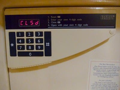
When you do consult the instructions, you learn that resetting the safe is the first step. The reason for this is that, while unlocked, the safe can operate in two different modes:

  • Mode 1 allows entering a new lock code
  • Mode 2 allows re-locking the safe with the previously entered code by pressing just the “*” key

Successfully un-locking the safe makes it switch to mode 2. In this mode you cannot enter a new code, though. If that is what you want to do, you first have to press the pound key to switch back to mode 1.

As if that wasn’t confusing enough, there also is a timeout involved here, after which the safe automatically switches to mode 1 when you leave its door open for a longer period of time after un-locking it. And there is no status indicator for this “feature”, so you can only guess what mode the safe is in.

Consequently, it is impossible to tell whether pressing the asterisk “*” key will immediately lock the safe. In that case, the currently active four-digit code is not displayed — you better make sure that you properly remembered which code you entered, or you risk being unable to un-lock the safe anymore!

The feature guessing game

The instructions that are printed onto the front panel of the safe don’t mention this re-locking feature. Also, the instruction’s phrasing is a bit unfortunate.

For example, my initial reaction to reading “1. Reset #” was: “Yeah, but how do I reset this thing?”. Only after my brain made the connection between the “#” in the instructions and the key labeled with that character did it become clear that I needed to press the “#” key. Which begs the question why the instructions don’t simply state just that: “1. Press the # key”.

What’s more, without being aware of the re-locking feature, the reset step hardly makes any sense to begin with. Why can’t I simply tap in a new code right away?

When one set of instructions is not enough

Inside the safe, I found a cardboard sign with slightly more detailed instructions, and these also mention the re-locking feature.

Cardboard sign with step-by-step instructions on how to use the safe

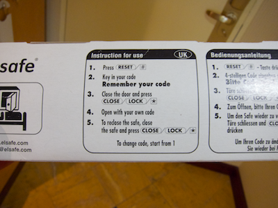
As you can see in the photo, they do not, however, mention the associated time-out. I guess that quite a few of this hotel’s guests press the “*” key, expecting the safe to lock — and are stumped by the fact that nothing happens at all. Because this “faulty” use of the device does not result in an error message or any other kind of feedback.

Simplicity vs. features

At first sight, the second safe’s re-locking feature appears to be a welcome convenience feature. But it is unreliable, because you don’t know which of the two modes the safe is in, nor when the time-out kicks in to switch back to mode 1.

When following the instructions step by step, entering a new code always requires the reset step even when the safe would be in mode 1 and, thus, accept a new code straight away.

And finally, unless you read and fully understand the additional instructions found inside the safe, the necessity of the first step will likely remain a mystery for you.

The first safe that lacks the re-locking feature may be just that little bit less convenient to use in some situations, but it is more user-friendly: Operating the device is more straight-forward and requires fewer steps; the instructions are simpler and shorter; and there is no guessing about any modes that the device may be in.

Especially when it comes to devices that many people will use for the first time, and then only use for a limited amount of time, it is more important that a device be easy to understand and convenient to use, than that it surprises more experienced users with more advanced features.


  1. Unless you count the door handle, of course… 

  2. If you’re interested in music technology, you may enjoy reading “iPad Rocks Musikmesse 2011” which I wrote for The Mac Observer. 

A Minor Face-Lift for FaceTime

Shortly after Apple released FaceTime for Mac as a public beta in October of last year, I took a closer look at its user interface. Judging from the web searches that this article pulled in — “edit facetime contacts”, “facetime remove favorite”, “resize facetime mac”3, etc. –, quite a few users must have been stumped by how FaceTime works.

Between the public beta and the final version that was released in February 2011, the Apple designers have modified a few details in FaceTime’s user interface, thus warranting a second look at this application.

Consistent single-clicks in the Contacts list

In the public beta, it was difficult to predict what would happen when you clicked on an entry in the Contacts list. Depending on the data stored for that person, FaceTime would initiate a call, take you to the person’s details, or request that you add more information via Address Book. Now, clicking will always open the person’s details view.

As a means for navigating the Contacts and Favorites lists, the beta supported the up, down, and right arrow keys, but there was no key command for leaving a contact’s details view. Now you can also use left arrow to move from a contact “up” into the Contacts list and also further into the new Groups list.

Additionally, you can leave any Edit mode via the Escape key now.

Editing contacts in FaceTime

FaceTime’s major new feature is being able to add, remove, and edit contacts right inside the application. To add a contact, you click the new “+” button above the Contacts list, and fill out the form that pops up.

FaceTimeAddContactsButton

Initially, you will only see one field each for phone numbers and email addresses, but as soon as you start entering data, another field appears instantly, as do Delete buttons next to existing fields in the same category.

FaceTimeNewContact

A Delete Contact button has been added to the contact details as well.

FaceTimeDeleteContactButton

This button comes with a major caveat, though: FaceTime still synchronizes its Contacts list with Address Book’s database. Any and all edits that you perform in FaceTime will also be applied to what is stored in Address Book. I wonder how many users will find out about this the hard way when all they want to do is prune the Contacts list in FaceTime.

I could only find a single reference to this link between the contacts lists in FaceTime and Address Book: It’s this one sentence in FaceTime’s help file:

FaceTimeHelp

I think the confirmation dialog box for deleting a contact should contain a warning which points out to you that, when you confirm the deletion, the contact will also be removed from Address Book. The lack of such a warning is a major, and dangerous, oversight, in my opinion.

FaceTimeDeleteContactConfirmation

Viewing contact groups in FaceTime

FaceTime now displays the contacts groups you defined in Address Book. Clicking the new Groups button above the Contacts list takes you to this view.

FaceTimeGroups

You cannot add or remove contacts from groups in FaceTime, nor can you add, remove, or edit groups themselves. Using the “+” and Delete Contact buttons while you’re “inside” a group will add or delete a contact completely. This may well be a cause for further confusion for some users.

Adding favorites more easily

In the beta, you could only add a contact to your list of favorites by clicking the Add to Favorites button inside the contact’s details. In addition to this button, the Favorites list now also features a “+” button as a convenient shortcut.

Note, though, that this button exacerbates the (or at least my) confusion about the Groups’ “+” button, since it does not create a new contact, but adds an existing one to the list of Favorites.

Searching your contacts

The release version provides a search field, which you can summon by selecting the Find command from the Edit menu.

FaceTimeSearchField

The search field is only available when viewing the full Contacts list, but not in Favorites, Recents, or Groups. The menu command, which shows or hides the search field, is disabled and enabled accordingly.

Which begs the question why the search field isn’t simply shown all the time, as that would also make it easier to discover this feature.

Safer silencing

You can mute FaceTime while it is running, so that it won’t ring when someone tries to call you.

In the beta, you would mute the application via an On/Off switch located in the preferences panel. There also was a menu item labeled “Sign Out”, but this would not only mute the application — it would also discard your entire account settings.

In the release version, the menu item has been renamed “Turn FaceTime Off”/”Turn FaceTime On”, and its behavior now is identical to the switch in the preferences, so your settings are always retained.

Unfortunately, it’s still the same at the core

While the Apple engineers and designers have modified these details in FaceTime’s UI for the better, the application still presents numerous interaction “surprises” and feels decidedly un-Mac-like.

The use of iOS widgets — e.g., for removing list entries or for navigating hierarchical lists — in FaceTime seems forced. They make for less-than-optimal interactions when compared to their native OS X counterparts. The most confusing aspect of FaceTime for the Mac is it’s not-so-obvious integration with Address Book, though.

To initiate a FaceTime call on an iPhone, you start out by opening a person’s entry in the Contacts app. Then you press the FaceTime button, which is located in the same place as the person’s postal address, email addresses, phone numbers, etc.

FaceTimeButtonOnIphone

In other words, in iOS, FaceTime does not stand alone, but is just one of many means to reach a person via the central contacts directory.

I wish the designers had used the same approach for FaceTime for Mac: place the FaceTime button on the contact’s “cards” in Address Book; limit the FaceTime application to the video window; and link the latter to the former via a “Open Caller’s Card in Address Book” menu command or some such.

That would likely have eliminated the evident confusion that some people have over how the Contacts list in FaceTime relates to Address Book’s.

FaceTime’s fundamental flaw

In its current implementation, Apple’s video chat service has a fundamental flaw that goes deeper than user interface details: In FaceTime, you don’t call a person; you call a person’s device.

FaceTime does not display a contact’s availability on the service, nor does it indicate if a specific device — a computer or phone represented by an email address or phone number, respectively — is even capable of accepting FaceTime calls.

FaceTimeCallOnIphone

Just imagine what the FaceTime experience across platforms could be like if the system would track which of a person’s email addresses and phone numbers can technically accept a FaceTime call, and on which of these devices that person is currently logged in.

Instead of having to try out several communication channels, you’d just click a single button to initiate a call to a person, and FaceTime would take care of getting you in touch with the desired person.


  1. Some of the searches do refer to the mundane task of resizing the application’s main window. It’s what happens when designers think they can get away with throwing out the resize handle graphics in the lower right corner of a window. 

Affordances in a Non-Standard Blister Pack

The usual method for dispensing a pill from a blister pack is to force it through the metal foil on the pack’s underside by pressing on the bulge containing the pill. Here is another design that, instead, requires you to peel off the backing foil.

Instructions are printed on the back of the box. If you miss these, the phrase “Hier Folie abziehen” (“Peel off foil here”) and an arrow pointing out where to start peeling, is printed on each individual segment of the blister pack.

Shipping carton and blister pack with instructions on how to remove a pill from the pack.

Additionally, the pack has an unusual design detail that guides the user: When you look at the pack’s bulge side, you can see cut-outs along its edge. These make it easier to peel off the metal foil, and they also provide a visual clue that this “device” effectively affords being pulled apart.

Cutouts along the edge of the blister pack, affording peeling off the metal foil.

If, at first, you do try to push out a pill as you would normally do, you will quickly realize that this won’t work since the foil is too strong. In that case, you will probably either turn the pack around to further investigate the cut-outs, thus discovering the explicit instructions on the back. Or you may intuitively try to peel off the foil via the cut-outs.

This combination of explicit instructions and affordances helps ensure that the user will understand how to properly “use” this blister pack even though this “use” differs from that of most other similar “devices”.