Natural Search for Street Intersections

A common way to refer to an intersection is to use the phrase “it’s at [street A] and [street B].” When I recently heard such a phrase in a podcast, I tried to find that location by entering the exact term on Google’s regular search page.

I was pleasantly surprised when the intersection’s geolocation showed up in the top-most spot on the results list. Which made me wonder how smart Google, Yahoo! and Bing are in understanding this particular kind of location search.

As my initial search term I used “van ness and california san francisco”1 in two ways: first by entering it into each website’s regular search field, and then by entering it into the destination field on the respective map search page.

Additionally, I performed a number of tests with further randomly picked locations to find out just how reliable and robust the search algorithms work.

Google

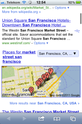
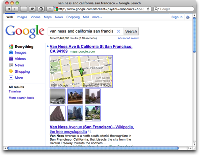
Although Google finds 2.44 million results for this search, the top-most one is, indeed, the intersection I am looking for. A small map gives a preview of the area, and the site also completes the street names by adding “Ave” and “St.” Clicking on the map preview opens the location in Google Maps.

IntersectionSearchGoogle

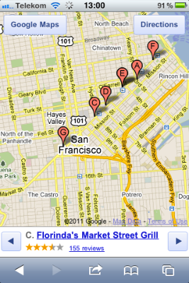
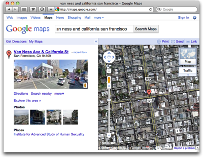
The direct search on Google Maps finds the same location and points it out on the map via a marker.2 A snapshot from Google Street View provides a first impression of what that intersection looks like in real life.

IntersectionSearchGoogleMaps

Google’s regular search failed to recognize a search for an intersection in only a few cases. Whenever this happened in my testing, the search contained a street name that has a more general meaning, like “University [Avenue]” or “Harmony [Road].” Adding the missing “street type identifier” — “ave,” “road,” “st,” etc. — reliably fixed the problem every time.

As for the algorithm’s robustness, even something as tricky as “california and berkeley berkeley california” (that’s “California Street at Berkeley Way, in Berkeley, CA”) could not trip the Google search engine. It immediately found the correct location.

Yahoo!

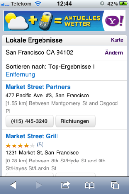
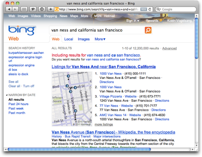
Yahoo!’s regular search finds almost as many matches as Google’s, but fails to recognize “van ness and california san francisco” as a reference to an intersection.

Judging from the inclusion of results that match the search string when replacing “california” with its abbreviation “ca,” the Yahoo! search engine interprets that word as the state, and not as the street that I am looking for.

IntersectionSearchYahoo

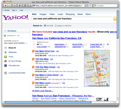
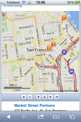
Yahoo! does find a number of locations along Van Ness Avenue and previews these on a small map, but these matches are obviously based on the location’s names instead of their geographical position.

When you click on the small map, you’re taken to a bigger map view on Yahoo! Local, which further confirms this assumption: The original search term has now been separated into a search for businesses whose names contain “van ness” and which are located in “San Francisco, CA” . This is clearly not what I wanted.

IntersectionSearchYahooLocalResults

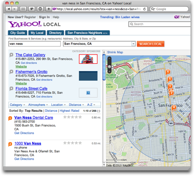
Even when I define my search more precisely by adding “avenue” and “street” to the term, Yahoo! presents similar, and similarly unrequested, results.

Regardless of the specific location, Yahoo!’s generally performs a literal search, so that it will match results based on entities’ names, descriptions, or addresses. The results will not, however, find a street or intersection as such.

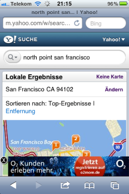
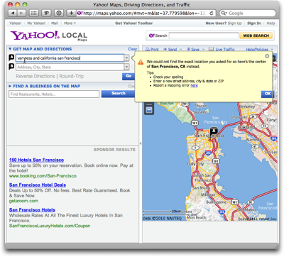
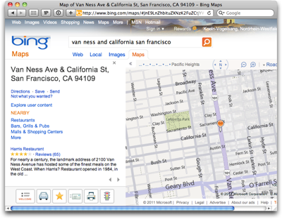
Disappointingly, even Yahoo! Maps failed to make sense of my original search term: An error messages stated that “We could not find the exact location you asked for so here’s the center of San Francisco, CA instead.”

IntersectionSearchYahooMaps

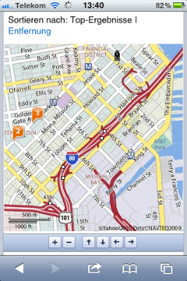
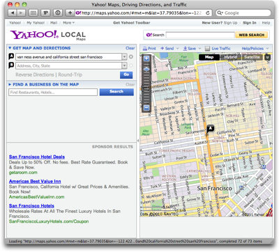
This time, adding “avenue” and “street” to the search did result in a perfectly good match.

In contrast to Google’s map page layout, Yahoo! does not display further information about the location it found. Instead, about a quarter of the actual map view area is taken up by ads (which, thankfully, can be hidden together with the map search form).

IntersectionSearchYahooMapsMatch

Locations with less ambiguous street names, like “austin and franklin san francisco” work just fine in Yahoo!, but the search algorithm is not as robust as Google’s. Case in point: “california and franklin san francisco” immediately finds this intersection, whereas “franklin and california san francisco” fails.
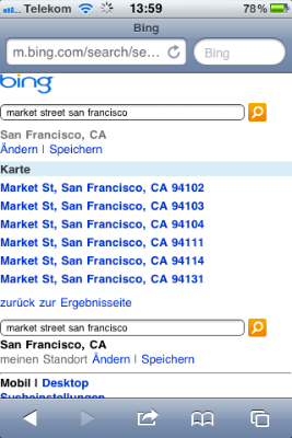
Bing

In essence, Bing behaves like Yahoo!.

Its regular search fails to properly interpret the search term as a street intersection. The matches it does list are based on “van ness” being contained in these matches’ names or addresses. Only such local results are displayed when you click on the map preview to transition to the Bing Maps site.

IntersectionSearchBing

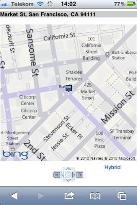
Bing Maps properly deals with intersection searches. Like Google, it expands the street names to include “Ave,” “St,” etc.

IntersectionSearchBingMaps

During my random testing, its robustness was better than Yahoo!’s, but not quite on par with Google Maps’ yet.

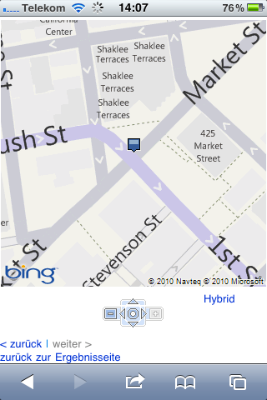
As an example, the search for “college and harmony fort collins” is too much of a challenge even for Google Maps, but extend it to “college ave and harmony rd fort collins,” and the site immediately finds this intersection.

IntersectionSearchBingOvertaxed

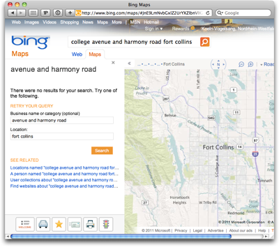
For Bing Maps, that latter search string is still too challenging, even when you click on the “Locations named…” link under “SEE RELATED.”

What’s in a map view

As I had mentioned, this observation started out with me hearing about an intersection in a podcast, and asking myself “What if I search for that intersection by describing it just the way that humans normally do?”

When technology, such as a search engine, is capable of understanding our goals and wishes even when we communicate them in a way that feels natural to us — i.e., in the same way that we communicate among us humans –, then the experience does have a touch of magic to it.

It’s when machines force us to think in machine terms, that this magic immediately goes “poof.”


  1. This is a random pick; I just happen to know both of these streets. 

  2. Before I ran this search, I had no idea that the institution listed under “Places” resides at that location. I swear…! 

Web Map Searches in Mobile Safari

Mobile Safari currently supports three search engines, Google, Yahoo!, and Bing. All three of these present their search results on web pages that have been optimized for viewing on mobile devices. Also, all three can show search results on a map. The are differences in how easy these maps can be navigated, however.

For testing, I used the search term “market street san francisco,” which has two interesting characteristics: first, the search engines should easily recognize this as a geographical location, namely Market Street in SF; and second, there is a good chance of also finding businesses that refer to Market Street in their name, or that are simply located along that road.

Here’s what I — quite literally — found.3

Google

Discovering the map: A map preview appears directly on the search results page. It’s just below the fold on an iPhone and shows a number of location markers.

The frame around the map has the same color as standard Google text links, indicating that the map itself is tappable.

MobileSafariGoogleSearchResults

Navigating the map: You move the map around via tap-and-drag. Double-tapping zooms into the map by a fixed ratio, and the pinching/spreading gestures zoom out of, and into, the map, respectively.

MobileSafariGoogleMapView

While these interactions may be difficult to discover because they are invisible, they do follow the standards defined by the Photos and Maps apps.

Finding search results on the map: Information about the locations that are marked, appears below the map.

If there are multiple search results, you can step through them with left/right buttons. When you do so, the map is automatically re-centered around the selected result. This also works the other way ’round: tap a location marker, and the information below the map will change to the corresponding location. All of this works without the map page being reloaded.

One detail I miss is a dedicated “Re-center” button to get back to your marked location in case you moved the map so far that the marker ended up off-screen. As a workaround for a search with multiple results, you can step to the next result, and then right back to the previous one, to find that location again. This won’t work for single search results, however, as you can see here:

MobileSafariGoogleMapViewSingle

Noteworthy details: The two buttons in the top corners of the map open the currently selected location in the “Search” and “Directions” views in Maps, respectively. In the case of “Directions,” the location is entered into the “End:” field for quickly looking up the route to get there.

Yahoo!

Discovering the map: The search results on Yahoo! include “local results” (“Lokale Ergebnisse”), but these are not displayed on a map (pre)view. To show the results on a map, you have to click a “Map” (“Karte”) link in the “local result” section’s header.

MobileSafariYahooSearchResults

Navigating the map: Yahoo! uses static images for the map, and displays it on a scrollable page.

To zoom in or out, or to move it, you have to tap on one of six buttons shown below the map. The only gesture you can use on the map is double-tapping, which will vertically center the map on the screen.

MobileSafariYahooMapView

The map’s navigation buttons are tiny. Although there is ample horizontal room on that button bar, the designer chose square buttons over wider, rectangular ones that would be easier to hit. There is hardly any room between the buttons, either.

The page is reloaded every time you move or zoom the map. Unfortunately, the vertical scroll position of the page may shift slightly between reloads. E.g., when I tapped the down arrow on this screen…

MobileSafariYahooMapShift1

… the map’s position moved slightly upwards after loading the new map image:

MobileSafariYahooMapShift2

Finding search results on the map: The list of search results is displayed below the map. Markers on the map show their corresponding locations.

There are no links between the two, though, so you have to manually correlate the list items with their respective location markers.

The page lists up to ten search results at a time. On the small screen of an iPhone or iPod touch, this means you will likely need to scroll back and forth quite often to fully grasp which map location belongs to which description.

Noteworthy details: Sometimes, Yahoo! will display ads as overlays at the bottom of the map page. These hide automatically while you are scrolling, but still feel more intrusive than the ones that Google sometimes displays right on the map.

MobileSafariYahooAdOverlay

Bing

Discovering the map: Bing displayed the shortest results list by far, with only two webpage links and three images. A map may also show up on the results page, unless the location it found extends over multiple ZIP code regions.

MobileSafariBingSearchResults

In that case, you only see a “Map” (“Karte”) text link, which takes you to a list of ZIP codes.

MobileSafariBingZipCodes

Imagine being in an unfamiliar city and running a web search similar to “market street san francisco.” Would you feel comfortable picking a neighborhood of that city to limit your search on, based only on a ZIP code?

I think that filtering a geographical search should happen via selecting a region in a map view, but not before you have even seen that map for the first time.

Navigating the map: The way in which Bing displays the map is similar to Yahoo!’s: the map itself is a static image on a scrollable page, buttons are used for zooming and moving the map, and (single-)tapping the map image centers the page.

It reloads the page to update the map image, and it also shares the flaw of not preserving the vertical scroll position between such reloads.

MobileSafariBingMapView

The buttons below the Bing map are even smaller than Yahoo!’s, and are placed even closer together. The location of the zoom buttons — one each to the left and right of the “cursor” buttons — is unfortunate, because it breaks up proper grouping of the controls for zooming and navigation. (Yahoo! gets this right.)

I do like the arrangement of the navigation buttons in a compass dial for its natural mapping. This one even features a “re-center around location marker” button at its center, whose functionality neither Google nor Yahoo! offer.

What I don’t understand is why the entire assembly isn’t at least twice as big. As you can see in the following screenshot, the reason for this design is not a lack of available space.

MobileSafariBingMapViewButtonSpace

Finding search results on the map: Interestingly, Bing comes up with much fewer search results overall. For “market street san francisco,” it only found the actual street, but none of the results — retail stores, hotels, etc. — that Google or Yahoo! found.

Some searches found a single correct match each, while other perfectly reasonable search terms like “apple store san francisco” or “cha am restaurant san francisco” came up empty. Yet other searches like “florinda’s market street grill san francisco” (as found by Google earlier) made Bing deliver “matches” that are surprisingly out of line:

MobileSafariBingFlorindaSearch

Noteworthy details: The results page itself is somewhat zoomable, i.e., its width is not fixed to that of the screen. When I first tried the spread gesture on the Bing map, I initially thought I could zoom the actual map this way, until I realized that I had zoomed the entire page.

MobileSafariBingZoomedPage

Show me the way, Google!

In general, using buttons for zooming and moving a map might work almost just as well as direct manipulation — albeit with a much smaller dose of “touch-screen magic.” The way that this approach has been implemented by Yahoo! and Bing, however, is plagued by a number of flaws.

The buttons are too small, their spacing is too narrow, reloading the page for every zoom or move operation feels disruptive, and manually correlating location markers with particular search results is tedious.

Google’s direct-manipulation map is not only more intuitive and more convenient to use. It also makes great use of the available screen real-estate, displaying all related data in a single screen-full that does not require any scrolling.

Being able to move and zoom the map without reloading the page gives you a great sense of direction: you can easily see where you are “going” while dragging the map’s contents around.

In short, despite being “optimized for mobile,” Bing’s and Yahoo!’s map web pages still feel like, well, web pages. In comparison, Google’s map feels like a veritable application: if it weren’t for the browser chrome, you might think that it’s a native iOS app.


  1. I was in Germany while testing this, so the look as well as the contents of the search results may differ from what you get in your own locale. 

One Weird Search Box

When I recently followed a link from a tweet, I ended up on the Display Blog, a weblog dedicated to the display technology business.

The site’s super-simple appearance immediately appealed to me. There is nothing on the page that can distract you from actually concentrating on reading the blog’s articles.

DisplayblogMainPage

Page navigation is simple, too: there’s a title banner linking back to the site’s entry page, and the standard pair of Previous Entries/Next Entries links. That’s it. No chronological archive, no tags, no keywords, no blog roll, …

Wonderful!

There is an unusual one-line “instruction” right beneath the title banner, though, according to which you can also search the site. The way to do so sounds almost magical:

To search, type and hit enter

To see if that would actually work, I followed these instructions in the most literal way: I just started typing a few letters, and hit the Enter key.

Nothing happened.

That’s, of course, because you first have to click on that very line of text to activate a search box which is hiding in the same location.

DisplayblogSearchField

Now, when you type, you can also see what you type, and hitting enter does bring up a page with search results.

Analog or digital: simple things should not require instructions

Within the realm of websites, a search box is a “simple thing.”

Average users have a basic understanding of how to perform a search on a website. At least, as long as the search field is easy to find, provides sufficient visual cues that say “I’m a search field!,” and operate in a standard manner.

The only reason why “instructions” are required on the Display Blog page is simply this: it’s because the search field does not look like a search field.

It’s just a small box drawn in a line that is so thin and light, you can hardly see it at all in the top-most screenshot above. It does not have a “Search:” label, it does not display a loupe icon, it lacks the inset shadow that has become fairly common for text entry fields, there is no button labeled “Search” — nothing about the search box itself says “I’m a search box!”

Even worse, the instructions that are provided, are incorrect since they omit the very first step in the process, namely “click here.”

If it ain’t broken…

The easiest way to fix this search box is to simply use a standard design. And that design does not even have to look dull or lack more extensive features. Just have a look at this search box on Lukas Mathis’ blog, Ignore the Code.

IgnoreTheCodeSearch

It looks like a standard OS X Aqua-style search box, has a cancel button, and a menu with search history. And yet it is easy to find even for non-Mac users, because its label explicitly states what it is: “Search.”

There is an equivalent to “if it ain’t broken, don’t try to fix it” in user interface design, and its essence is:

If users are familiar with a de facto standard way to use a certain feature, stick with that standard in your own designs.

If you break this rule, you will most likely create unnecessary usability problems like the ones I ran into with this search box on the Display Blog.