Another person and me get on a hotel elevator. I press the button for my floor, she presses the one for hers. When the elevator stops at the floor that she selected, a very puzzled look appears on her face. Then she presses the button for one floor higher up. Apparently, she was unsure what button she had to press to get to the desired floor.
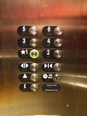
Here’s the control panel from that elevator:
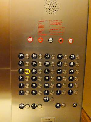
Look at it in its entirety, and you can easily see that the button for a certain floor is positioned to the right of its label.
The curse of a regular grid
If you focus in on any buttons that are located near the center of the panel, however, it becomes difficult to tell whether the button on the left or on the right of a label is the one to press to get to the desired floor.
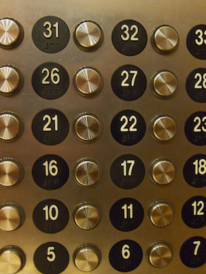
Both labels and buttons are positioned on a more or less regular grid, so you cannot easily make out the pairings between the two.
If, once you press a button, the number on a label would light up, you could at least quickly see whether you had made the appropriate choice. Instead, rings around the buttons light up to confirm your selection, as seen is the top-most photograph.
Even more challenging for vision-impaired users
The labels feature braille numbers underneath the digits, which explains the digits’ odd vertical offset. Despite this welcome feature, I would expect blind users to have even more problems with using this panel, because there are no tangible connections between the labels and the buttons.
So, to understand which button belongs to which label, blind users would have to first find the edges of the panel, understand that the panel starts with label plaques on the left and ends in buttons on the right, and, keeping this knowledge in mind, find the right label/button pair on the panel.
Let’s closure this case
Let’s assume that the designers chose the regular grid layout on purpose. In that case, adding more horizontal space between label/button columns to make the panel more user-friendly probably is not an option. Placing the labels right on top of the buttons would also improve on this design, but how about another approach.
With a thankful nod to the Gestalt Law of Closure, I would change the shape of the number labels like this:
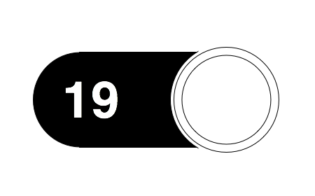
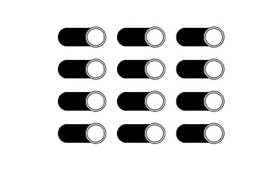
This firmly groups paired labels and buttons together visually. A grid of these labels and buttons with the same spacing as the original would look like this:
By adding a bezel to the label plaque, or by embossing the entire plaque, blind users could also feel the connection between label and button.
Placing the braille dots between the number and the button would achieve two things: the vertical position of the number is more visually pleasing, and after reading the braille pattern, blind users’ fingers would automatically end up properly on the neighboring button.
Update 2011-02-08: This building sports a total of six guest elevators, but they are not created equal: one of the six can take its passengers to an additional floor that remains hidden from view in the other five elevators.
After using the elevators for a few days, my mind had developed a mental model of them, part of which postulated: “To go to the lobby, press the single button that is located, horizontally centered, right below the large panel of buttons.”
One day I got on the elevator and, relying on this mental model, intuitively reached for the 1st-floor button and pushed it as I would normally do. Only this time, I realized that nothing was happening: out of the corner of my eye, I noticed that the ring around the button did not light up even after I had pushed the button repeatedly.
Taking a closer look at the button panel, I now saw that, on this one elevator, there was an additional button labeled B1. Not only was this button placed on the same line as the one for the first floor: in an attempt to preserve the panel’s more or less symmetrical appearance, the 1st-floor button had also been moved one column to the right.
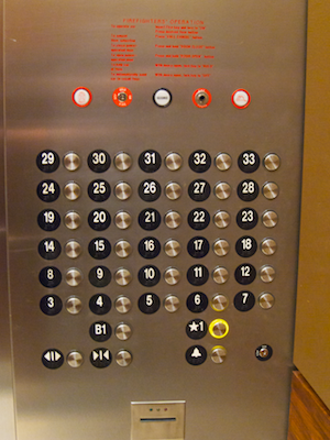
As I have written previously, moving controls in a user interface oftentimes creates annoying usability problems. Although the effects in this case are not quite as severe as the ones explained in that earlier blog post, the button for the 1st floor should be found in the same location on all six elevators.
If the majority of users doesn’t have access to a certain feature, hide it
As for the B1 button, I assume that hotel guests ususally cannot even go to that floor. Otherwise, why did the button refuse to accept my (erroneous) request to go to that floor? If it is necessary to somehow “unlock” the B1 floor before being able to use the associated button, why implement it as a button in the first place?
By looking and generally behaving like any other floor button, users expect that it can also be used just like the other ones.
If using a key in one of the locks seen on the panel is required to successfully use that button, one option would be to implement its functionality as part of that very lock. Assuming that this lock controls more than just the B1 floor button, it could have three positions: 1 – special access locked, 2 – special access unlocked, 3 – Go to floor B1. Position three would operate just like the “start engine” position on a car’s ignition lock, i.e., after selecting it, the key would be pushed back to position number 2 by a spring.
This implementation would remove that ominous B1 floor from the users’ view and mind, and prevent accidentally hitting this button when all you want to do is go to the lobby.
Update 2011-02-28: Different hotel, different elevator — different button labels!
This elevator sports much fewer buttons, making it possible to grasp the entire button panel at a single glance. It is much less challenging to make out the pairings between buttons and labels in this case.
And yet, whoever designed this, seems to share my point of view that labels should provide a strong visual cue about which button they belong to:
What I find surprising, is that the buttons have been crammed together like this. Laying out the floor buttons in a six-high/one-wide column would have made for better mapping; adding more space between the floor, door, and emergency buttons would have created a stronger division into the three functional groups.