Winemaking is an ancient culinary technique. Storing the result in glass bottles is an ancient culinary technology. And de-corking a bottle of wine must have been a major nuisance ever since a bottle was first sealed with a piece of tree bark back in ancient times.
There are countless designs of “de-corking devices”1 that are so intricate that simply calling them corkscrews would be a disrespectful understatement. And then there is the so-called “sommelier knife,” which, in my most humble opinion, still is the most elegant solution due to the sheer genius of its simplicity.
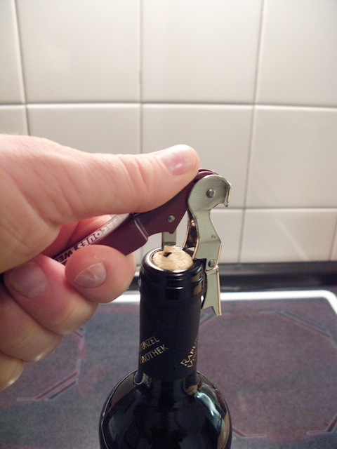
A sommelier knife — also known as the waiter corkscrew — looks like a plain corkscrew with the helix mounted via a hinge, so that it conveniently folds away for easier storage.
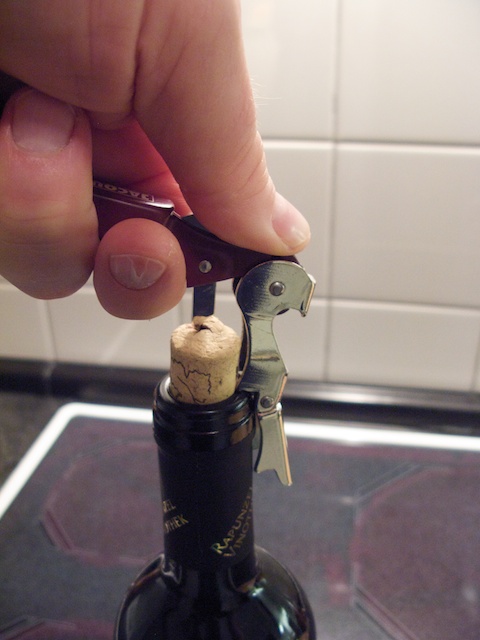
The nifty part is a little lever at one end of the handle: after you screw the helix into the cork, this lever is placed on the rim of the bottle’s neck. You then gently force out the cork by lifting the other end of the handle.
“Gently” is the keyword here, because there is no uncontrollable release of force once the cork pops out of the bottle’s neck, as you may encounter when using a plain old corkscrew. You’re also less likely to break the cork while pulling it out.2
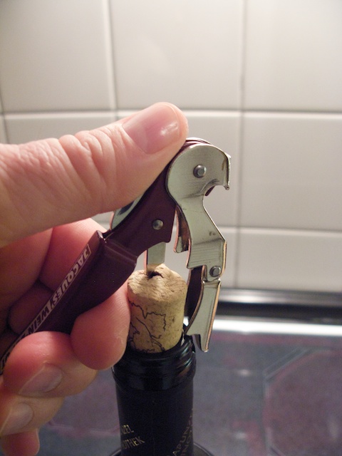
The only minor drawback of a regular sommelier knife is that you can’t fully twist the helix into the cork, or you won’t be able to properly place the lever on the bottle anymore. Similarly, if you don’t insert the helix far enough, you won’t be able to fully remove the cork from the neck without adding a few extra twists between pulls.
The solution to this problem is a wonderful example for the power of simplicity: as you probably have noticed in the above image, the lever on this specific sommelier knife is divided into two segments. These are joined together with a hinge, and both segments are shaped so that each can lock onto the bottle’s neck.
Thanks to this design twist3, you simply screw in the helix almost all the way, place the first lever segment on the bottle neck, pull out the cork half-way, and repeat the process now using the second lever segment.
When actually opening a bottle with this tool, you would firmly wrap your other hand around the bottle’s neck. Doing so prevents the sommelier knife’s lever from slipping off, and it also keeps the bottle from toppling over. (Which is quite the impossible challenge when you’re taking pictures of the process without having a tripod at hand, of course…)
-
For an overview of what’s available, have a look at this selection of “wine openers” at an online retailer. (Just an example, not an endorsement.) ↩
-
That statement is based purely on personal experience and observation. Your cork breakage may vary. ↩
-
That must be the cheapest pun I have ever used, but I just couldn’t resist. ↩