The very first article on the UI Observatory describes Prof. Jan Borchers’ “Ten Rules for Good Usability”. The Ten Rules’ aim is to help consumers gauge a product’s usability before making a purchasing decision, and this follow-up article will examine a real-world example for how to apply them.
The device
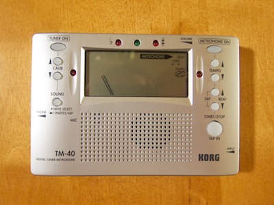
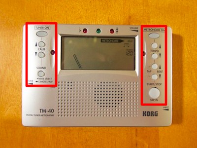
For any guitarist, a tuner and a metronome are essential tools. When I started playing electric bass about two-and-a-half years ago, I purchased a Korg TM-40, which combines both tuner and metronome in a single, handy device.
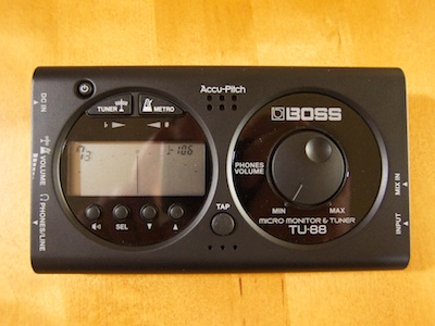
Just recently, I bought a similar combo device, a Boss TU-88. Comparing these two devices with the help of the Ten Rules resulted in some interesting observations about the devices’ usability.
How the devices work
Like its classic cousin, an electronic metronome provides a precisely timed click sound, which helps musicians practice playing in perfect time. In addition to the simple click provided by the mechanical specimen, most electronic metronomes offer several beat patterns, using two differently pitched clicks for adding an accent to the first down-beat of a pattern.
The key controls for this kind of device start and stop the metronome, adjust the tempo, and select the beat pattern.
State-of-the-art guitar tuners are ingenious pieces of technology: you plug the instrument’s cable into the tuner, pluck a string, and the tuner analyzes the note you’re playing. LEDs and/or a gauge indicate whether the string is in tune, or not. And if it’s out-of-tune, the device shows whether the string needs to be tuned higher or lower to get to the target note.
For basic use, all that is required to control the tuner is a button to switch it on or off.
With the exception of a simple headphone amplifier that is integrated into the Boss, both devices do not provide any functionality that goes beyond the tuner and the metronome. They are very similar in their feature-sets and, thus, make for a great comparison.
1. Simplicity
“The device should offer the functions you really need, and not too many more.”
As outlined in the original “Ten Rules” article, the first step is to compile a list with the three functions offered by the device that one expects to use most often. In the case of the tuner/metronome, my list looked like this:
- Tune my bass (i.e., de-/activate the automatic tuner feature).
- Start/stop the metronome.
- Change the tempo of the metronome.
The list of less-often-used functions that I also expect to use, includes a single item:
- Change the meter, or “beat”, of the metronome.
Although either device offers a few additional features beyond these four, they do not add any excessive complexity because — with the exception of the Boss’s built-in headphone amp — they are all related to the core tuner and metronome functions. Both devices pretty much focus on what I need.
In the following sections, I will focus on the user interface details related to the four functions from the lists above.
2. Gestalt Laws
“The positioning of the device’s controls should make sense to you.”
On both devices, all essential user controls are located on the front panel. The layout of the controls, however, is decidedly different.
The Korg TM-40 has two distinct groups of buttons that are lined up in vertical columns. These columns are clearly labeled “Tuner” and “Metronome,” respectively. Even if you do not know (yet) what each button does, you can easily tell which group of controls affects which of the device’s functions.
Within these two groups, the buttons are further differentiated by their shape, position, and size:
- The power buttons are oval, whereas the others are round,
- the tuner’s Sound button is slightly removed from the Calib[ration] buttons, and
- the Start/Stop button — which is most likely the most-used control on this device — is much bigger than the Tempo and Beat buttons, so it’s easy to see and hit.
Compared to the Korg, the Boss’s layout is more cluttered in terms of the controls’ location, grouping, and shape. It has four groups of controls: the three buttons above the display for power/tuner/metronome, the four buttons below the display, the Tap button, and the headphone volume dial. In fact, one could argue that, because of their different shapes and their positions relative to the circular bezel, the power button and the tuner/metronome buttons form separate groups, bringing the total to five groups of controls.
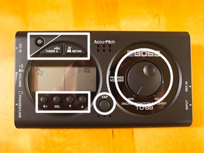
Generally speaking, it seems as though the Boss’s designers placed a lot more emphasis on visual aesthetics than the Korg’s. As a result, the Tuner and Metro[nome] buttons are oddly shaped to fit into the circular bezel; valuable space is wasted around the volume control dial; and the Tap button’s location on the front plate gives it way more visual “prominence” than it deserves.1
3. Visibility & Feedback
“The device should make it easy for you to discover both what it can do, and what it is actually doing, at any given time.”
Both devices’ displays clearly show which function is enabled at any time, and both play short beeps for the metronome’s clicks, which are accompanied by bright LEDs lighting up in-sync. Similar LEDs are used for the tuner, indicating whether the string is tuned properly to the correct note, or whether it is too low or too high, respectively. So far, so equal.
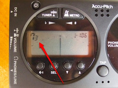
To configure the metronome in the Boss TU-88, the user has to set two separate parameters, one for beat pattern and one for the number of beats per bar. For more complex patterns, the second parameter selects the number of bars for the pattern. Both parameters are displayed as single-digit numbers without any identifying labels, so that you need to remember which digit represents which parameter.
For the pattern parameter, you also need to remember which pattern is assigned to which number, because the list of patterns is only found in the users manual, but not on the device itself.
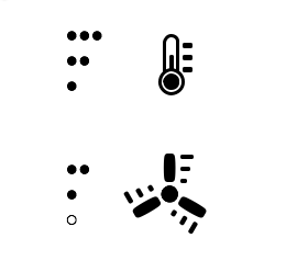
The Korg designers have implemented a more-intuitive solution by combining a single-digit number with a few symbols to indicate the metronome’s pattern setting: when selecting the pattern, the device steps through different straight meters like 3/4, 4/4, 5/4, etc., and then through a few special patterns, including eighth notes and triplets. Straight patterns are indicated by the single-digit number, whereas the special patterns have their own note symbols.
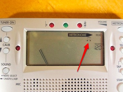
Consequently, it’s simpler and more intuitive to select a metronome pattern on the Korg than it is on the Boss: simpler, because there is a single parameter instead of two, and more intuitive, because icons that are meaningful to any musician are shown on the display instead of an abstract number. (see also “6. Enough Controls” below)
4. Speaking Your Language
“The device should communicate with you in a language you understand.”
Both devices ship with an extensive users manual, and the labels on the faceplates use words and icons that any musician should be familiar with.
The only details that may be confusing when using either device for the very first time are the button “Sound” on the Korg and the button labeled with a speaker icon on the Boss, which both control the same function: they switch a tuning tone on or off, whose pitch you can adjust, and against which you can tune non-electrical instruments.
After you have used this button for the first time, the label should be sufficiently intuitive to help remember what these buttons do.
5. Natural Mappings
“The way the device reacts to your input should feel natural.”
On both devices, some values, like the metronome’s tempo, can be increased and decreased.
On the Boss, two buttons control all such settings through a number of modes (see “6. Enough Controls” below), and these two buttons are arranged horizontally. While, at least in our Western culture, “move towards left” means “less” and “move towards right” means “more”, that mapping has much less urgency than a vertical arrangement, in which “move upwards” means “more” and “move downwards” means “less”.
The Korg designers chose to arrange the three pairs of decrease/increase buttons on the TM-40 in this more natural vertical arrangement.
6. Enough Controls
“There should be enough controls to access each function in only very few steps.”
The tuner and metronome in the Korg have their own dedicated power buttons, so you can switch both sections on or off individually, and even use them at the same time, if you so choose.
All key settings that affect the functions I put on my required-items list — start/stop the metronome, and adjust its tempo and pattern — are accessible directly through a start/stop button and two pairs of decrease/increase buttons.
The Boss has a dedicated power button, and the Tuner and Metro[nome] buttons switch between the two modes of operation, with the Metro button doing double-duty as the metronome’s start/stop control. The buttons beneath the display are shared between tuner and metronome.
To make adjustments, you press the Sel[ect] button repeatedly until you have selected the desired parameter, which starts blinking on the display. Then you use the down/up buttons to adjust the parameter. Although the device is fully operational while a parameter is selected, the blinking on the display can be a bit distracting, so you will likely choose to press the Sel button a few more times until you have left the parameter selection/setting mode.
As a result, changing the metronome’s tempo on the Boss requires pressing the Sel button three times before you can perform the actual adjustment. Contrast this to the Korg’s dedicated down/up buttons, that provide immediate access to the tempo parameter.
Usage modes tend to generally make a device more inconvenient, if not more difficult, to use. Especially when applying a device to a creative endeavor like making music, modes easily get in the way and disrupt the user’s creative flow.
Considering how often a musician will adjust a parameter as fundamental as a metronome’s tempo, I dare say that the Boss’ designers have made a surprisingly bad decision when they implemented this modal approach.
7. Consistency
“The device should not surprise you in bad ways.”
Aside from the visibility issues with the meter/beat selection on the Boss, the only “surprise” I noticed is related to having separate power and tuner/metronome selection buttons on this device.
Switching the Boss on requires pressing the power button first, and the device will then start up in the mode that was active before it was powered off the last time. If it starts up in tuner mode, pressing the Metro button switches to the metronome mode; if, however, it starts up in metronome mode, pressing the Metro button will start the metronome.
8. Dialogs, not Monologues
“The device should ‘listen’ to you at all times, and ‘talk’ to you when necessary.”
The Boss’s settings modes aside, any button presses or dial adjustments affect both devices’ operation immediately, and the data shown on the displays reflects such changes just as quickly.
9. Error Tolerance
“The devices should help prevent errors, and if they happen, make it easy to recognize and fix them.”
Due to the nature of both of these devices, making an error could cause as “dramatic” a problem as the metronome clicking away at the wrong tempo. In other words, any errors you could make by using this device have negligible consequences, and can be fixed easily and quickly.
10. Vertical Design
“As few companies as possible should be involved in the device’s design.”
Prof. Borchers made this point in connection with software running on personal computers and mobile devices, where several software and hardware components may be supplied by a number of different manufacturers.
For simple self-contained gadgets like this one, this point does not apply.
Going beyond the ten rules
The Ten Rules provide helpful guidelines for gauging a product’s usability, but there usually are some factors that they do not address.
For example, the Boss TU-88 has rubberized pads on the underside, which prevents it from sliding around on a slippery surface, whereas the Korg TM-40 may be pulled off a table merely by the weight of the guitar cable.
Unlike the usability of a device’s user interface, it is much harder to detect such details that may affect everyday use. Then again, actively applying the Ten Rules when checking out products at a store may still help find such things. That’s because you tend to take a much closer look at a device than you would when basing your purchasing decisions on feature lists or in-store demonstrations alone.
Play before you pay
At first sight, the Boss TU-88 and the Korg TM-40 offer similar functionality and a more or less similar user interface. When applying the Ten Rules, however, it becomes obvious that there are differences between the two that have a noticeable impact on how easy and how pleasant it is to use either device.
The most obvious detail is setting the metronome’s tempo and pattern: the Korg lets me access both of these parameters directly via dedicated buttons, whereas the Boss forces me into a selection mode before I can make adjustments.
When trying out these adjustments a few times in the store, you probably won’t notice much of a difference. But as soon as you use the device on a regular basis, a small detail such as this will hugely influence your satisfaction with your purchase.
With the help of the Ten Rules, even non-expert consumers should be able to get a feel for this kind of subtle and not-so-subtle differences in usability well before finalizing a buying decision.
-
The Tap button is used for the “tap tempo” function that is found in both devices. When this mode is active, the tempo of the metronome can be set by tapping the Tap button in time. This is a handy feature for identifying the tempo of a song by tapping the beat in sync with a music track, etc. Since I hardly use this feature myself and, thus, did not include it in my list of required features, however, I won’t examine this any further in the context of this article. ↩