When you order something online, wouldn’t it be great if you could tell which carrier will deliver your order? Let me tell you a quick anecdote why I wish that every online retailer would provide this information.
A crappy delivery of a premium product
On a frosty March evening in 2015, three boxes were delivered to our home. They contained a brand new laptop and some peripherals.
Although the order confirmation stated that a signature was required on delivery, the driver just dropped the boxes off on our front porch. We were both home at the time; the driver simply didn’t bother to ring our doorbell.
If I hadn’t checked the online tracker one more time that evening, the shipment would have sat outside in the freezing cold overnight. Or might even have been stolen.
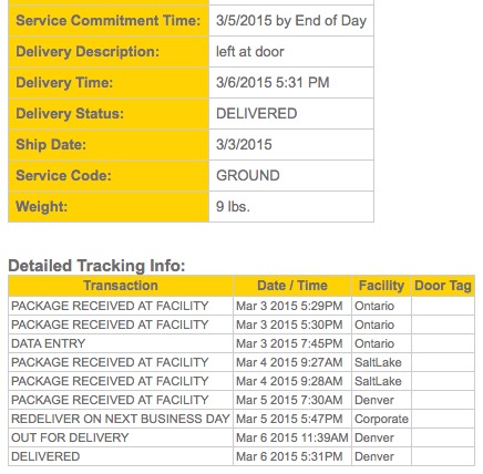
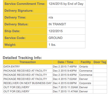
The delivery was a day late, too. Unfortunately, the tracking page did not give any reason for the delay beyond stating “REDELIVER ON NEXT BUSINESS DAY.”
Also, this carrier does not seem to consider Saturdays to be business days, as I found out via another shipment. The data in the screenshot below — December 4th, 2015 — was a Friday. Despite the “REDELIVER ON NEXT BUSINESS DAY” status, it still didn’t arrive on the 5th, but on the following Monday.
It’s not just me being excessively picky or demanding: The support forums at Amazon and Apple, who both use this carrier, are overflowing with complaints from customers who are extremely unhappy with this carrier.
All together now: “UX is all about setting expectations!”
It’s needless to say that I’d love to avoid having anything delivered by this company in the future. And I am more than willing to pay a premium to achieve this goal.
I do want to know with certainty, though, that I’m not paying extra and still have to deal with these people. Which is why I sincerely appreciate that, for example, the great folks at Adafruit make it very clear who they will entrust with getting your purchases to you.
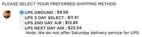
They also do not offer Saturday delivery, but they very prominently state as much right in the appropriate context of the shipping options.
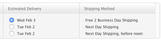
Apple, on the other hand, leaves you in the dark about which livery the truck will have that stops by your house to drop off your freshly ordered goodies.
Let me have more trust in my options
I wonder why a premium brand like Apple would collaborate with a below-par discount service provider in the first place. If they do go that route, though, they should at least give me a premium delivery option that reliably selects a different carrier and, thus, results in a more enjoyable overall customer experience.
After all, who wants to be all excited with anticipation for two days, looking forward to a shiny new laptop, only to find that machine in the morning, frozen to death on the front porch.
Oh, sorry, I meant “excited with anticipation for three days,” because “REDELIVER ON NEXT BUSINESS DAY,” you know.