How Search Engines Implement Auto-Correct

When you search the web these days, you will notice that most search engines automatically correct “mistakes” in your search terms: If you submit a search that resembles a more common word or spelling, the sites modify it accordingly.

This is helpful if you make an actual typo, but can get in the way when searching for a more exotic word or phrase. Therefore, the search engines not only notify you of any such correction; they also allow you to choose which of the two searches you actually would like to run.

To find out how Bing, DuckDuckGo, Google, and Yahoo implement this feature1, I searched for “ux desine,” which — not surprisingly — all of the sites changed to “ux design.”

Bing

The auto-correct notice appears below a few ads that are shown at the top of the results page. The notice is easy to spot, but it’d probably benefit from a bit more white space above and below it, so it stands out more.

The notice’s text is easy to understand: The displayed search results are based on both the original search term and the corrected one. By clicking either link in the notice, you can summon matches for only one of the two.

Browser window with Bing results page, displaying the notice 'Including results for ux design. Do you want results only for ux desine?' towards the bottom of the page. Both search terms are clickable.

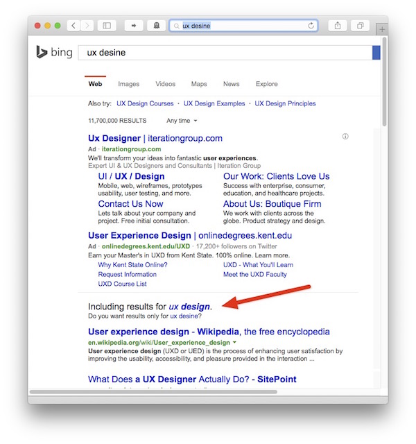
But there’s a problem: For this specific search, the auto-correct notice still appears on-screen without any scrolling. If you look at the Yahoo example below, however, you can see that, at least on smaller laptop screens, ads at the top of a results page can potentially push the notice off the screen.
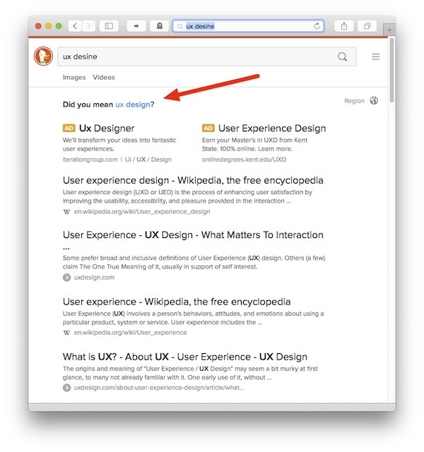
DuckDuckGo

In DuckDuckGo, the auto-correct notice is located at the very top of the page, so it’s easier to spot than its Bing counterpart. Its text is confusing, though.

The notice states, “Did you mean ux design?,” but the results on the page already contain that phrase. So, are the displayed results based on my original search term, or the auto-corrected one, or do they combine results for both?

Browser window with DuckDuckGo results page, displaying the notice 'Did you mean ux design?' at the top of the page. The search term is clickable.

Google

Google also displays the notice at the top of the page.

In contrast to DuckDuckGo, however, the text is unambiguous: The search is based only on the auto-corrected search term. If you would like to see results for your original term, you need to click a link in the notice.

I’m not sure why Google also makes the auto-corrected search term clickable, because, at this point, it is already displaying the results for it. Maybe its function is to place the auto-corrected text into the search field.

Browser window with Google results page, displaying the notice 'Showing results for ux design. Search instead for ux desine' at the top of the page.  Both search terms are clickable.

Yahoo

Yahoo cooperates with Bing for search functionality. The auto-correct notice and its placement are similar between the two.

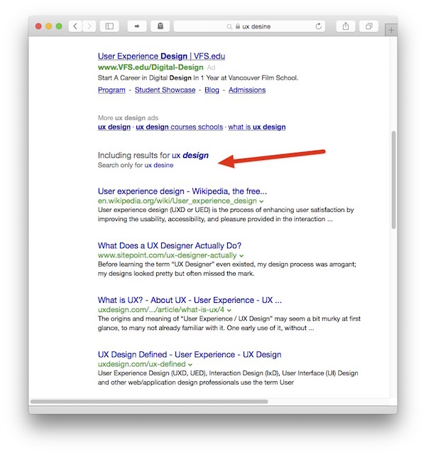
Unlike Bing, Yahoo’s ads push the auto-correct notice off the screen for the given search term. This makes the notice more difficult to spot compared to it being anchored to the top of the page.

Browser window with Yahoo results page, showing only ads, but no auto-correct notice at all.

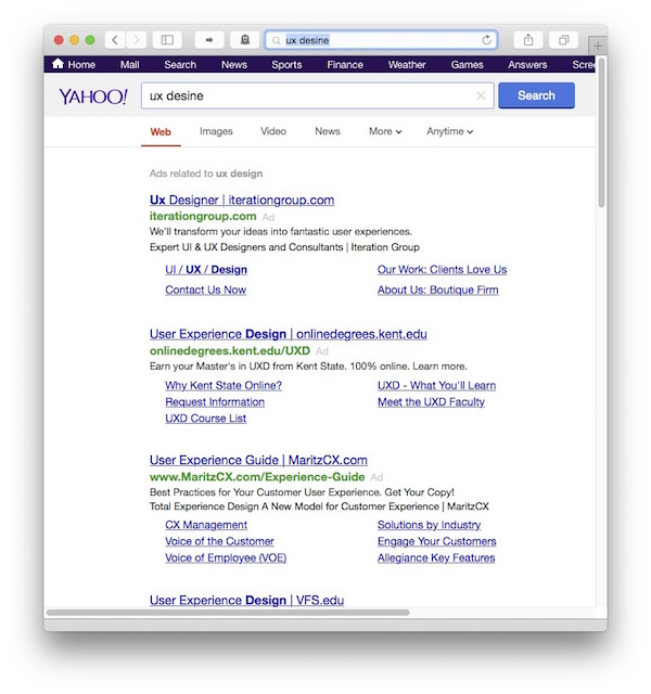
The way that Yahoo marks ads exacerbates the problem: Instead of displaying a little “Ad” label next to each ad block, there’s a single line, “Ads related to ux design,” at the top of the page. When you scroll down on the page, and that line is moved off screen, it’s impossible to tell which links on the page are ads, and which are actual search results.

Note how this ad “warning” also includes the auto-corrected search term, whereas both the browser and Yahoo’s search field contain the original term. Unless you scroll down, you won’t see the explanation of why the two search terms differ, nor would you be able to tell what terms the search is based on.

Browser window with Yahoo results page, scrolled down a little bit. Now, the notice 'Including results for ux design. Search only for ux desine' is visible.  Both search terms are clickable.

One web searcher’s opinion

Of these four approaches, Google’s easily is my favorite:

  • The auto-correct notification always appears at the top of the page, so I can instantly verify that the results actually match my intended search,

  • the notice’s text is unambiguous and easy to understand, and

  • I can also precisely search for either my original search term, or for the corrected version.

  1. According to Wikipedia, Bing, Google, and Yahoo! are the most popular search engines in the English-speaking world. DuckDuckGo seems to be the most popular non-user-tracking English-language search engine. That’s why I picked these four. 

The Struggle With Defective Train Doors

A car’s fuel gauge displays the fill level of the vehicle’s fuel tank. Although the two are closely associated, the gauge is mounted in the dashboard, far away from the tank.

The tank’s fill level is most relevant to the driver while operating the car, of course. And so it is displayed within the driver’s “use context,” instead of, say, being indicated on the fuel filler door.

More generally speaking, information must be displayed in the context within which it most relevant and most “findable” for the user.

I was reminded of this when I read the following story on Twitter about several people struggling with a defective door2.

So many “dumb” users — or are they?

6 dumb people with 2 baby strollers and plenty of suitcases are standing in front of a defective [train] door for one full hour. Although there are multiple out-of-order signs on the door, they only realize [that the door won’t open] after pressing the open button ten times. So one of them runs ahead to the next door and blocks it until everyone in that party has gotten off the train.

At the same time, three other people are standing outside the train, and one after the other, they push the open button five teams each, before they head to another door.

And surely, Deutsche Bahn will be to blame again.

Here is a photo of a similar door that’s also out-of-order. Note the location of the signs in the windows.3

Train door showing four out-of-order warnings placed in the door's windows.

When a user interface does not behave as expected, users often develop “UI tunnel vision:” instead of looking for helpful clues outside of the narrow context of the UI controls, they tend to focus on those controls even more.

This behavior is often exacerbated if users are nervous or in a rush. As a result, they can overlook a sign that is — literally — right in front of their nose.

Out of sight, out of mind

Look at the photo and imagine that you focus on the round, green open button. You will realize that it is perfectly possible to overlook the out-of-order notices on the door’s windows — especially when you are eager to get onboard, and there are people standing around you that are just as nervous to get on the train now.

I’ve committed that very “user error” myself.

When I arrived at my destination, I tried to open “my” door by moving its handle. Although the handle went through the full arc of operation, the door wouldn’t unlock. It took me a while to finally notice the “door-won’t-open” sign on the window and, thankfully, managed to find another exit just in time before the train was about to leave the station again.

Interestingly, other passengers were waiting with me at that same door.

None of us had noticed the out-of-order sign.

Display information in the relevant context

Deutsche Bahn has used this design for years now, but it obviously doesn’t work well.

What I would love Deutsche Bahn to user-test is this: Place at least a part of the warning signs right on top of the open buttons. Cover old-fashioned door handles in a cloth bag, and place the sign close to the handle.

This not only places the information right where users focus their view when trying to open a door. The signs also provide a tactile “hint” if they feature a rougher texture than the smooth plastic of the buttons or handles.

Of course, without actual testing, there is no telling whether this solution would work, either. Then again, instead of sticking with a design that is flawed, they should at least try to find a solution that makes their passengers’ experience that little bit less stressful.


  1. Translated into English from these German tweets: Tweet 1Tweet 2Tweet 3Tweet 4 

  2. Image of the train doors is an excerpt from this photo by Armin Schwarz. Used with kind permission. 

A Red Ribbon to Your … Mounting Hardware?

People who love books also tend to love book shelves. And, man, do I love books.

Consequently, I occasionally install new shelves when I run out of space after a few too many I-hope-I-find-the-time-to-actually-read-all-of-these book purchases.

Some of the books on my shelves, showing titles related to cognitive psychology and creativity

The packaging of my favorite shelves sports a nifty feature: Before you even open the carton, you will notice a “very red” ribbon at one of the carton’s short sides. The ribbon’s end is being held in place by a prominent label that says, “Hardware Enclosed.”

The large carton containing the shelves' parts. The red ribbon is clearly visible on the cardboard.

There’s treasure at the end of the ribbon

When you follow the ribbon while unpacking the carton, it will lead you to a little cardboard box. That box contains all the hardware required to assemble the shelves.

The small, red cardboard box is attached to packaging elements inside the large carton. The red ribbon attaches to that small box.

The box contains two plastic bags, one of which is marked, “Spare.” To properly assemble the shelves, you need to use all of the items that are contained in the other, non-spare plastic bag.

So if you find any left-over screws, nuts, etc. after you complete the assembly, you don’t have to wonder whether these are spares, or whether you made a mistake: Since all spares are in the “Spares” bag, finding any unused mounting hardware always unambiguously means that you screwed up somewhere along the process.

Two plastic bags contain numerous mounting hardware parts like screws, etc. These bags are contained in the small, red cardboard box that the ribbon is attached to.

The hardware box is stashed deep inside the shipping carton between all the larger wooden parts and numerous styrofoam filler boards. Including the red ribbon as a guide to that box effectively prevents the user from accidentally overlooking the box and possibly throwing it out with the bigger carton.

User Experience relates to all aspects of the product, however mundane they may seem

Considering this unusual eye for (packaging) detail, it fits into the overall picture that the shelves’ assembly guide is very well-written too, and that the assembly process is very straight-forward as well.

Even with something as simple as a bookshelf you can easily tell whether its designers understand how to create a great user experience, or not. If they do, you will see it in the entire product, and not just in a few details.