The Case of the Mysteriously Missing iBooks

Every now and then, I tidy up the media libraries on my mobile devices. When I sorted through the documents in the iBooks app recently, I noticed that two books — Aaron Cordova’s edition of The United States Constitution and the Little Snitch 3 documentation — appeared on the iPad, but not on the iPhone.

It took a friendly reminder from fellow-UX designer, Phil Suessenguth, to make me check whether these two titles were iPad-only.

Unfortunately, Apple makes that check surprisingly difficult.

A hint on the iPad — if you can find it

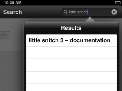
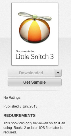
For starters, I searched for “little snitch” in iBooks on the iPad. It came up as the sole search result.

iBooks finds one matching title for my search term, and lists it in the Results menu.

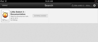
When I tapped it, the book’s overview appeared. Because it was installed on the iPad, its status was properly displayed as “Downloaded”. This view does not indicate the book’s iPad-only status, though. For that, you need to dig a bit deeper.

Now, the search shows the book's cover, title, author, release date, and ratings, but it does not state that this book is iPad-only.

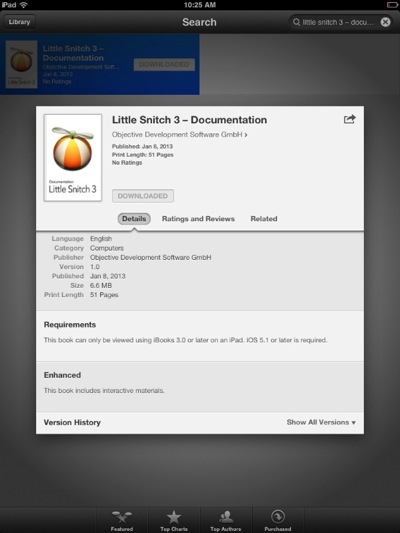
After tapping the item, and scrolling down the Details section, I finally found a Requirements field. It is in this field that Apple tells you that this book is only compatible with the iPad.

Only the Requirements section in the iBook Store's Details view clearly state that 'This book can only be viewed using iBooks 3.0 or later on an iPad.'

On the iPhone, the user experience is much worse.

“I ain’t telling you nuthin’!”

Performing the same search on the iPhone, iBooks did find the book again. My expectation with search results like this is that if you tap on any of them, you will be taken to the respective product’s details.

On the iPhone, the title appears in the search results list as well.

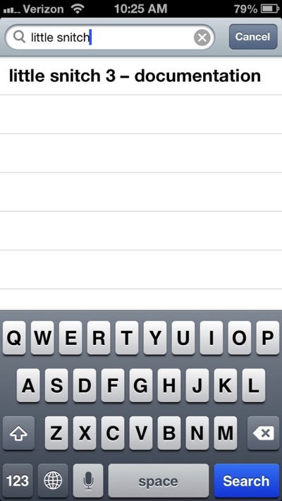
Not so in this case: Tapping the single search result brought up a blank screen, even though the app clearly found the exact title I was looking for.

While the search field does show the exact title of the book I was searching for, the results view beneath it is completely blank.

At first, I thought I had run into a bug. So I terminated iBooks, relaunched it, repeated the search, and got the same result.

Worse yet, while the two books appear in the iTunes library on my Mac as well as in the Purchased Items list on the iPad, they are completely missing from that list on the iPhone. In fact, based on what you get to see on the iPhone, it’s as if I had never purchased the books at all, and I never could.

A hidden hint in iTunes

In the iTunes desktop application, you can see a book’s requirements when you view it in the Store.

This detail view shows the Requirements section with the iPad-only notice, as it is displayed underneath the book's cover shot in the iTunes desktop app.

That changes as soon as you have downloaded the book: When you view it in the Books section of your iTunes library, there is no hint about a book’s iPad-only status. The Info dialog box on the book doesn’t help either, as the Kind field simply states “Purchased Book”, which applies to any book downloaded from the iBooks Store.

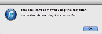
There is one place in the iTunes application, after all, where the compatibility information is displayed even for downloaded books: it’s the dialog box that opens when you double-click a book in iTunes.

The warning dialog box states that 'This book can't be viewed using this computer. You can view this book using iBooks on your iOS device.'

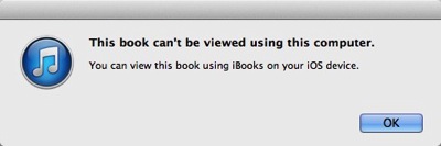
Note how the ending of the second sentence changes if the book is iPad-only. Instead of “your iOS device”, it now says “your iPad”:

At first sight, this dialog box looks identical to the previous one. Its second sentence, however, ends in 'using iBooks _on your iPad_.'

This hint is so subtle, however, that I doubt it will be easily discoverable when you’re specifically looking for this piece of information.

Tell me what’s going on!!

If you missed the Requirements section when purchasing a book, or if you simply forgot about a specific book being iPad-only, the entire iTunes/iOS/iBooks infrastructure will leave you guessing why some books are synchronized to some, but not all, of your iOS devices.

Fixing this problem is easy:

  • In iTunes, an icon in the Books or List views could indicate the iPad-only status. The “kind” field could say “Purchased book (iPad only)”.

  • In iBooks, an icon could indicate iPad-only books, similar to how the “+” icon in the App Store indicates universal iOS apps that work on both iPhone and iPad.

  • On an iPhone, iPad-only books could appear in the Purchased Books list with their download buttons disabled and labeled “iPad only”. The same design approach could be used in the Store’s Search results list.

I find it baffling that this specific information is not provided in more prominent, more easily discoverable ways.

Embedding a Maintenance Schedule in Clever Packaging

Modern vacuum cleaners are equipped with two air filters: One protects the appliance’s motor by filtering the air that is sucked in, and the other protects the user’s lungs by preventing fine dust particles from exiting the exhaust.

These filters need to be replaced regularly, but much less frequently than dust bags. Manufacturers that sell filters and dust bags separately, place the burden of keeping track of these replacements on the user.

At least Miele makes their customers’ lives a bit easier by bundling filters with dust bags into one retail box. The box contains four dust bags and one each of the two filter types.

A photo and the line '4 + 1 + 1' show that this box bundles dust bags with motor and exhaust filters.

The manual for Miele’s vacuums states:

An [exhaust] filter is supplied with every box of Miele dust bags. It should be replaced each time a new box of bags is started.

A similar statement addresses the motor filter.

Make sure one box is completely empty before you start the next

There is one flaw in this design, though.

Judging from the bundle, each filter should be good for use with four dust bags. By following Miele’s instructions of replacing the filters when you start a new box of dust bags, however, you would throw out the two factory-installed filters in a brand-new vacuum after filling just the one pre-installed dust bag.

The fix? Don’t replace the filters when you start a new box of dust bags, but when you finish it.

Hidden Dairy, Hidden Handle, Hidden Thermostat

While I hope to finally be done with writing about claiming missing airline reward miles, another travel-related area should provide many more interesting things to share with you: Staying at a hotel.

Here are three new observations from that realm.

What’s in that fridge?

Whether you’re staying at a budget motel or pick luxury accommodation, breakfast is almost always served as a buffet. At swankier places, fruit, dairy, cold cuts, etc. are presented on elegant porcelain plates, seated on piles of crushed ice to keep the products fresh.

Less luxurious hotels usually serve pre-packaged, (more or less) brand-name-quality items that you will find at any supermarket. Instead of the more elegant “iced buffet” setup, more perishable products are simply stored in a fridge.

The challenge for the restaurant management, then, is to make it easy for their guests to find the breakfast delights they are looking for.

The straight-forward solution is a fridge with a glass door.

Two refridgerators side by side in a hotel breakfast buffet. One has a glass door, which lets you see what's inside without having to open its door.

You can instantly see what’s inside that fridge. Before you open the door, you can conveniently make selection, which also benefits the environment as it preserves energy.

The second-best approach is to list the fridge’s contents on its door. Best intentions of the restaurant staff notwithstanding, I found the 90s style clip-art-sporting label on this fridge a bit lacking in design prowess, but also in terms if information architecture.

A sheet of paper is affixed to the fridge with the opaque door, showing the Activia brand symbol, a generic milk carton sketch, and an Activia yoghurt cup. All in glorious gray-and-white, and rather fuzzy at the edges.

The Activia logo at the top is only meaningful to someone who knows that brand, as is the somewhat obscure Activia-branded yoghurt cup on the right. The milk carton is more easily understood, but the “perspectivized” word “Milk” is difficult to read, especially from a distance, and especially for older eyes.

My guess is that simply placing the words “Milk & Yoghurt” in large type on that fridge would be much easier to understand for the average guest.

How (the heck!) do you open this thing?

The much more painful challenge that almost every guest had with both fridges, though, was actually opening them. Here’s a shot from a somewhat different perspective.

While you can see -- and feel -- the hinge brackets that hold both fridges' doors in place, there is no handle on either door.

See how both fridges lack an easily distinguishable handle?

Almost every person I observed was running their hands along the edges of the door to find a way to grasp it. The solution to this usability riddle is a groove that runs along the top of the door, and which you can grab — kind-a, sort-a — with the tips of your fingers.

Even after people had found that groove, they still struggled with predicting towards which side the door would open. Although the hinge brackets are visible, guests did not seem to notice them. No wonder, since the hinges’ black paint “nicely” blends in with the rest of the enclosure.

How expensive would it have been for the manufacturer to add a plain, simple, and highly visible handle to the fridges’ doors?

The position of such a handle would unmistakably indicate where and in which direction to pull, and on what side the door opens. They would also make it easier to get a good grasp on the doors, especially for older users or those with limited mobility in their fingers.

One set of controls for show, another for functionality

Moving from the breakfast buffet area into our room, this hotel features the typical, all-American, wedged-underneath-the-window air conditioning device. If you’ve ever stayed at a hotel with this kind of cooler/heater combo, you know that they can be ridiculously noisy. This specific unit was no exception.

Thankfully, its control panel is in plain sight right on the unit, and the controls themselves are simple enough to quickly spot the colder/warmer buttons, as well as the main power switch.1

The design of the control panel on the A/C unit is simple enough that it's easy to find the buttons for setting the temperature, or for switching the unit off completely.

To my dismay, however, I kept pressing the buttons, but nothing happened.

My assumption was that, for some reason, guests were not allowed to change the machine’s setting. It’s that thing about “to the user, the UI is the system”. I.e., if the user interface does not seem to work, something in the system is either broken, or I’m not allowed to operate it or modify its configuration.

My assumption was wrong.

The next morning, after a somewhat sleepless night, we noticed a second control panel mounted to the wall opposite from the window, all the way across the room. You can see it in this photo, if you look very closely: It’s that minute silvery-white rectangle just below the floor lamp’s screen.

A tall floor lamp's screen at the other end of the room blocks the view of the thermostat mounted to the wall.

Here’s a better view:

The old-fashioned wall thermostat, ironically, has a less user-friendly user interface than the non-functional controls on the A/C unit.

It took just a few button presses to verify that this control panel worked just fine.

To whomever designed that Activia-branded dairy label for the fridge: Can you please print out a sheet that says “Adjust via thermostat on opposite wall”, and scotch-tape it over the A/C unit’s built-in controls? And, yes, in every room in your hotel, please!

Thanks!


  1. For something as simple as an A/C control panel, this is a really neat design: Note the correct mapping of the colder/warmer buttons, the helpful use of color, the application of the Gestalt Law of Proximity for grouping the controls on the panel, and the plain-language labels.