How One Extra Feature Reduces a Hotel Safe’s Usability

When staying at hotels, in-room strongboxes provide safe and convenient storage for valuable electronics like laptops and cameras. All you need to do to lock away your precious geek gear is to place it in the strongbox, close the door, and type in a four-digit code.

Type in the same code to unlock the strongbox, and that’s all there is to it. Or is it?

Typing in your code

Here’s the safe I found in my room while staying in Munich for the fabulous IA Konferenz last May.
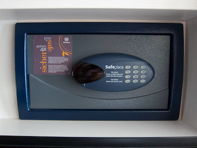
Front view of a hotel safe

A four-digit LED display and a number pad are its only user controls.1 They are located on the device’s front panel. Concise instructions on how to use the safe are printed between the two.
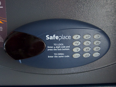
Close up of the hotel safe's keypad and display

When you press any of the keys, the entire keypad lights up, so you can easily use the safe even if it has been mounted in a tight, dark closet compartment, or under dim lighting.

The number corresponding to the selected key appears in the display, whose number segments are bright enough to also be readable in less-then-ideal lighting conditions.
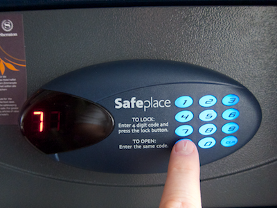
Typing a key on the safe's backlighted keypad

Every keypress is accompanied by a short beep, with each key’s beep having its own pitch. This may help visually impaired users with remembering and re-entering their code.

The “5” key at the center of the keypad features two small tactile “spikes” on its surface, which make it easier to navigate the keypad by touch alone.

Unfortunately, the designers of this safe decided to implement a very short time-out for entering the code: if you pause for a mere 2 or 3 seconds, the display goes dark, the keypad’s backlighting is switched off, and you have to start over.

Although the vast majority of time-outs constitute serious design flaws, this specific one does make sense, because it helps reduce the safe’s energy consumption by switching off the display and keypad backlighting. Its duration is simply too short, however: The user should have more time for entering the code than just a few seconds.

Your valuables under lock and key

To close the safe, you shut its door, type in an arbitrary four-digit code, and press the LOCK key. You then hear the lock bolt move into position, accompanied by an “animation” in the LED display, and followed by a mildly annoying confirmation melody.

Finally, “Clsd” appears in the display, followed for a few seconds by the lock code. Seeing the lock code one more time is a very welcome opportunity to confirm that what you had entered is, indeed, what you thought you had entered.

To unlock the safe, you just type in your code again. The safe is unlocked immediately after you enter the code’s fourth digit, unless you made a mistake.

Although it is not mentioned in the instructions, the CLR key clears your recent entry so you can start over if you made a mistake. It is, however, possible to operate the safe without ever using this key. Ironically, it’s the short time-out that makes this possible.

You did it wrong!

The safe is a bit less user-friendly if you do make a mistake: Enter fewer than four digits before pressing the LOCK key, and “Er04” is displayed, and a not-so-mildly annoying error beep is played.

Since I did not encounter any other numbered errors, I wonder why the designers included the somewhat confusing number instead of displaying a plain “Err” message.

In case you enter an incorrect code, the safe responds be displaying “Code” and playing an error beep.

While I’m on the subject of the display: Interestingly, the mapping of the animation on that display, which represents the lock bolt moving inside the safe door, is reversed in this specific device.

In basically every door, the lock bolt is located opposite from the door’s hinges so that, when the door is locked, the bolt moves away from the hinges. On this safe, however, the animation moves towards the hinges (which are mounted at the left edge of the safe’s door) when it locks.

Apart from these two criticisms — numbered error code and animation mapping –, the only other idea I thought of while observing this device is to set the “LOCK” and “CLR” keys apart from the number pad and/or color them differently, so as to make them stand out more visually.

One socket to charge them

But there’s one more thing! And a seriously cool thing at that: this safe is equipped with an internal power outlet.
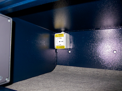
A standard (European) power socket mounted inside the hotel safe

Thanks to this brilliant feature, you can charge your laptop while it is safely stowed away inside the strongbox. It’s one of those rather rare “I wish you’d see this everywhere!” ideas.

Works just as advertised

A hotel safe is a fairly simple device, and the specimen from Munich is as easy to use as it should be:

  • The controls are easy to discover.
  • Clear and simple instructions are found right next to the controls.
  • There are no confusing modes.
  • Visual as well as acoustic feedback abounds and clearly communicates the device’s state.

While attending Musikmesse in Frankfurt back in March2, I encountered a similar safe that had one additional feature. Undoubtedly, the designer’s intent when adding this feature was to make the safe more convenient to use.

As it turned out, this one feature made the safe more difficult to use.

Let’s make this more complicated (with best intentions)

This safe has a slightly different visual appearance, but essentially works the same way.

Unlike the other safe’s instructive LOCK and CL[EA]R key labels, this model’s non-numeric keys are labeled with generic pound “#” and asterisk “*” characters. It’s unlikely that you can predict what either key does without first reading the instructions.
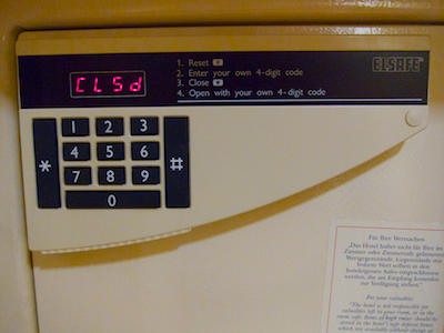
Another safe's front view, showing a differently laid-out number pad

When you do consult the instructions, you learn that resetting the safe is the first step. The reason for this is that, while unlocked, the safe can operate in two different modes:

  • Mode 1 allows entering a new lock code
  • Mode 2 allows re-locking the safe with the previously entered code by pressing just the “*” key

Successfully un-locking the safe makes it switch to mode 2. In this mode you cannot enter a new code, though. If that is what you want to do, you first have to press the pound key to switch back to mode 1.

As if that wasn’t confusing enough, there also is a timeout involved here, after which the safe automatically switches to mode 1 when you leave its door open for a longer period of time after un-locking it. And there is no status indicator for this “feature”, so you can only guess what mode the safe is in.

Consequently, it is impossible to tell whether pressing the asterisk “*” key will immediately lock the safe. In that case, the currently active four-digit code is not displayed — you better make sure that you properly remembered which code you entered, or you risk being unable to un-lock the safe anymore!

The feature guessing game

The instructions that are printed onto the front panel of the safe don’t mention this re-locking feature. Also, the instruction’s phrasing is a bit unfortunate.

For example, my initial reaction to reading “1. Reset #” was: “Yeah, but how do I reset this thing?”. Only after my brain made the connection between the “#” in the instructions and the key labeled with that character did it become clear that I needed to press the “#” key. Which begs the question why the instructions don’t simply state just that: “1. Press the # key”.

What’s more, without being aware of the re-locking feature, the reset step hardly makes any sense to begin with. Why can’t I simply tap in a new code right away?

When one set of instructions is not enough

Inside the safe, I found a cardboard sign with slightly more detailed instructions, and these also mention the re-locking feature.
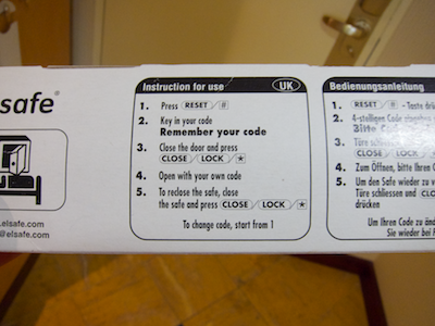
Cardboard sign with step-by-step instructions on how to use the safe

As you can see in the photo, they do not, however, mention the associated time-out. I guess that quite a few of this hotel’s guests press the “*” key, expecting the safe to lock — and are stumped by the fact that nothing happens at all. Because this “faulty” use of the device does not result in an error message or any other kind of feedback.

Simplicity vs. features

At first sight, the second safe’s re-locking feature appears to be a welcome convenience feature. But it is unreliable, because you don’t know which of the two modes the safe is in, nor when the time-out kicks in to switch back to mode 1.

When following the instructions step by step, entering a new code always requires the reset step even when the safe would be in mode 1 and, thus, accept a new code straight away.

And finally, unless you read and fully understand the additional instructions found inside the safe, the necessity of the first step will likely remain a mystery for you.

The first safe that lacks the re-locking feature may be just that little bit less convenient to use in some situations, but it is more user-friendly: Operating the device is more straight-forward and requires fewer steps; the instructions are simpler and shorter; and there is no guessing about any modes that the device may be in.

Especially when it comes to devices that many people will use for the first time, and then only use for a limited amount of time, it is more important that a device be easy to understand and convenient to use, than that it surprises more experienced users with more advanced features.


  1. Unless you count the door handle, of course… 

  2. If you’re interested in music technology, you may enjoy reading “iPad Rocks Musikmesse 2011” which I wrote for The Mac Observer. 

A Radio Alarm Clock Designed Specifically for Hotel Rooms

Hotels in large cities make for excellent UI observations, because these places serve as temporary homes for international visitors with diverse cultural backgrounds. It is a challenge for any designer to ensure that all of these guests will be able to easily understand and properly use the hotel’s facilities, like door handles, make-up mirrors, and elevator control panels.

Another category of devices regularly found in hotels are radio alarm clocks. This article is about one such clock that was specifically designed for use in guest rooms.

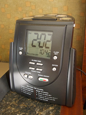
Hilton radio alarm clock on a hotel room nightstand

When I saw this alarm clock during a recent stay at a hotel, I vaguely remembered that it had been announced to much fanfare a few years ago. A quick online search revealed that the device was custom-designed for Hilton hotels group, and when it was introduced in 2005, the press release hailed it as the radio with the “World’s Easiest-to-Set Alarm Features:”

The new Hilton Family clock houses a sleek design and simple digital alarm interface for buzzer, radio wake-up and snooze. The simple-to-set alarm feature requires just three easy steps (also printed on the front of the clock): 1. Press Alarm Set; 2. Indicate Alarm Time preferred by using increase or decrease buttons; 3. Press Enter.

Kudos to Hilton for leveraging user-friendliness as a customer benefit, and also for creating public awareness for this aspect of the user experience!

What is so special about this clock?

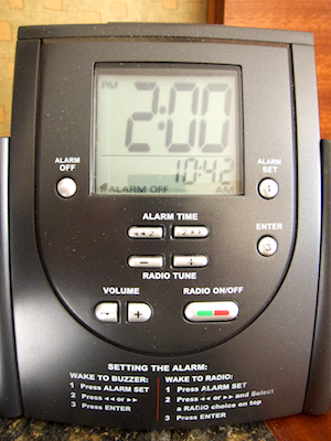
The most obvious difference between this radio alarm clock and other similar devices are the explicit instructions on how to set the alarm time, which are printed right onto the front panel. All related buttons on the front panel have numbers printed on them to link them to the respective steps in the instructions.

The front panel of the clock with display, control buttons, and printed-on instructions

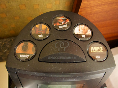
To set the alarm you press the ALARM SET button; adjust the time via the ALARM TIME forward and backward buttons; optionally choose a radio station via the picture buttons on top of the device; and finally press the ENTER button.

Radio station presets and snooze button on top of the clock

Pressing ENTER activates the alarm and sets the alarm type to “Radio Alm” or “Buzzer Alm,” depending on whether you pressed a radio station button, or not.

The combination of a simplified adjustment process; the explicit, “non-lose-able” instructions right on the device; and the numbers on the buttons to help find the required controls for each step, not only make the actual adjustment much easier than on other clocks. They also make it much easier to discover how that adjustment is performed.

A suggestion for making an easy-to-use device even easier-to-use

When I played around with the clock, I found the layout of the controls a bit impractical, what with the buttons being scattered all over the front panel.

Additionally, due to the buttons’ shapes and positions, some of them are visually grouped even though they are not related, e.g., the two ALARM TIME and the two RADIO TUNE buttons at the front panel’s center.

I also noticed a real design flaw: despite its label, the ALARM OFF button does not always switch off the alarm. Rather, it cycles through the three alarm types, radio, buzzer, and off. If you press the button with the intent to deactivate the alarm, you may just change it from radio to buzzer, instead.

In other words, in some situations, the result of pressing the ALARM OFF button is neither what you would expect, nor what you intend it to be. A simple fix would be to change the label to “ALARM MODE.” An even more user-friendly and more reliable design approach is to provide three distinct buttons, one for each alarm mode.

Don’t make me go modal

Speaking of modes, setting the alarm on this clock is, in fact, modal: pressing the ALARM SET button enters the mode, pressing ENTER leaves it. I doubt that there is an actual need for this mode.

If there were three separate buttons in place for selecting the desired alarm mode, it would suffice to let the user set the alarm time by pressing the backward or forward buttons.

Even more so since this clock always displays both current and alarm time, so that both are always visible to the user; there is no need to enter any mode to check the currently set alarm time.

The two keys change the alarm time by a minute per keypress, unless you hold them down, in which case the time is advanced automatically. Still, the risk of accidentally modifying the alarm time by more than just a few minutes is reasonably small.

Small enough, I would say, that the benefits of the quicker access to modifying the alarm time outweighs the risks of inadvertently changing the time by a non-trivial amount.

After swapping out the ALARM OFF button for three distinct mode buttons, and removing the mode for setting the alarm time, the next step would be to change the layout of the front panel so that both controls and instructions are grouped more closely. Consequently, the need to link instructions and buttons via numbers no longer applies.

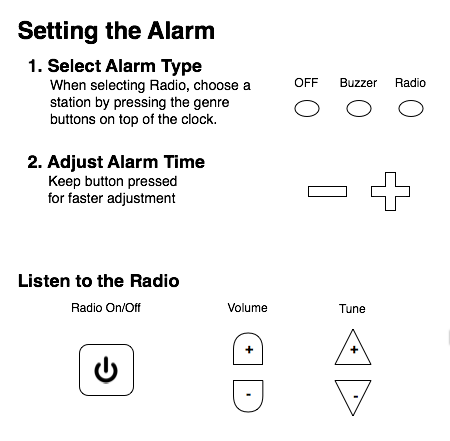
Rough sketch with a redesign of the clock's front panel

The alarm type selection is displayed right above the respective mode button in plain text. An additional LED above each of these buttons could provide even better feedback, but such bright status lights may be bothersome to guests who are such light sleepers that they require a totally dark room in order to find good sleep. Hence, the status indicator for the alarm type remains on the clock’s LCD.

The alarm time buttons are shaped as minus and plus signs. Besides the prominent visual cue this also provides tactile feedback. As for the buttons’ position, even though they are not directly adjacent to the display anymore, they do align vertically with the alarm time on the display.

As a welcome side effect, this modified layout opens up some space below the alarm controls, adding a clear distinction between alarm and radio controls. The shapes of the radio sections on/off, volume, and tune buttons all differ, adding yet more visual as well as tactile differentiation.

What Donald Norman thinks of this device

When, halfway into writing this article, I did some further online research on this device, I saw that Donald Norman had also commented on this clock.

In response to his initial unabashed enthusiasm about the clock, readers of his site wrote in to point out several flaws in the device.3

Among these flaws is the erratic behavior of the ALARM OFF button, for which Norman suggests the same fix that I have outlined above: use three separate buttons for each of the three alarm modes.

A problem I had not encountered, because I played around with the clock during the day, is that you cannot read the control’s labels in the dark. I would assume that this could be addressed by using fluorescent paint for the button labels or a back-lit front panel.

Finally, another reader complained that setting the alarm time with just two buttons would be “terribly awkward,” to which Norman replies:

Holding either button down increments the time at the rate of two minutes per second. If the button is held down for 5 seconds, the setting time then increments at the rate of 10 minutes per second: it this[sic!] increments an hour in six seconds. This is slow enough to stop close to the desired setting, yet fast enough not to be a burden.

While I had not measured the clock’s hold-down time-outs and advance speeds this meticulously, I did not feel that setting the clock was tedious. The handling was swift enough to set the clock fairly easily, while still making it sufficiently precise to stop its advance when approaching the target time.

As for changing the alarm time inadvertently, Norman considers the corresponding mode a good thing:

Many clocks have this failing [of making it too easy to change the alarm setting], allowing a single button press to change the time or alarm setting. As a result, a single button error changes the setting, and in a device meant to be used by sleepy people, in the dark, errors of this sort are guaranteed. Better clocks require simultaneous depressing of an “Alarm Set” button to change the alarm time, thereby eliminating accidents. (The Hilton clock requires the clock to be in “Alarm Set Mode” which solves the problem.)

On the risk of sounding conceited, I disagree with Norman on this point. As I have outlined already, quickly brushing against either of the alarm set buttons will change the time by only a handful of minutes, which should not have too much of an impact on a guest’s risk of missing their flight, business meeting, or dinner date.

Having to press another button in addition to the actual time set buttons, however, is awkward, and it also potentially creates accessibility problems.

Notwithstanding the room for improvement in the current design, it is a great move for a major corporation like Hilton hotels group to even address usability on such a scale, with such public awareness, and with a product that does deliver on its promise of easier-than-usual user-friendliness.

A virtually silent postscript

Unfortunately, the radio section of the clock in our room did not work. Pressing “Radio On/Off” or any of the genre buttons did not do anything, so I could not test that functionality.

Interestingly, though, when I followed the process for setting the “radio alarm” for testing, the device would fall back to buzzer alarm. Interesting.

Update 2011-03-17: Via email, Lars Feyerabend chimed in to share his opinions about this clock.

Agreeing that the “Set Alarm” mode is not necessary, he goes on to say:

[T]hey should rather make those “Radio alarm buttons” on the top of a device mechanical toggle buttons like they had back in the days. They stay “pressed” to signal their state, but when you press another button, every other button gets de-pressed.

Lars points out an important aspect that I hadn’t addressed: the radio genre buttons on top of the device do not indicate the current selection.

Since, as I had mentioned in the postscript, the radio in our alarm clock did not work, I could not check whether the selected genre is displayed on the clock’s LCD screen. If not, the buttons could be equipped with LEDs or lighted rings, or implemented as mechanized buttons as per Lars’ suggestion.

And the Alarm Off cycle confusion and “alm” display could be taken care of with a simple hardware slider. Three positions: Off, Buzzer, Radio.

Compared to positioning your finger over a button and pressing it, “targeting” the center position of a hardware slider requires more motor precision. This potentially makes it awkward to use, especially for older users.

What’s more, with a three-position slider, you will always activate — however briefly — the center setting when moving between the two outer positions. Assume the positions from left to right are “Off,” “Buzzer,” and “Radio”. If you selected radio alarm, and the radio just started playing to wake you up, you probably don’t want to make the obnoxiously-sounding alarm buzzer go off when moving the slider to the “off” position to silence the radio.

There is a consensus, however, that three distinct physical controls — or three physically different positions on a single control — for selecting the alarm mode will work better than the current single button that cycles through the modes.

When selecting the radio [alarm type], the buttons on top might even light up briefly to signal the additional choice. In “Off” position the alarm time would be hidden from the display.

While I am not sure whether users would find it confusing if the alarm time vanished from the display, or not, I really like the idea of the genre buttons lighting up on top of the clock to guide the user to these additional controls.

And last, but not least, I’d replace those pesky +/- buttons with rotary controls. Endless and “push-to-change” for time adjustment and regular, bounded ones for radio tune and volume.

I could see the use of rotary dials for setting the volume, and maybe for radio tuning. For setting the clock, though, I’m skeptical whether this would be a good choice.

I’ve used a few clocks that had a single rotary dial for adjusting the time. Rotating them would adjust the minutes, and the hours would roll over as if you were setting an analog clock.

The problem with this approach is that the dials either work too slowly, so that many turns are required, or they are overly sensitive and operate so fast that setting the time with precision becomes a major challenge.

If dials were used for this control purpose, the clock would probably require two separate ones for hours and minutes.

In an amusing coincidence, Donald Norman has also written about the Hilton radio alarm clock again recently. Stating that the clocks often fail to display the correct time, and that it is virtually impossible for hotel guests to adjust them properly, he makes this suggestion:

Meanwhile, if you want a good alarm clock, carry your own. I highly recommend the clocks on modern smart phones which take advantage of their numerical keypads and large, attractive displays.

For setting highly structured data fields like the time, numerical keypads create their own set of usability problems. If you have seen someone struggle with typing in the time via a keypad, and never being really sure which digit is currently being set, you will know what I mean.

In the end, Norman tells Hilton to “Try again. This one was a nice try. Time for a new, improved version.”

I agree: Hilton’s efforts are commendable, even though the end result still leaves room for improvement. I do hope they will come up with a version 2 of this clock. And I can’t wait to see whether it will feature up/down buttons, radial dials, or a keypad for adjusting the alarm time, and whether that process will still be modal.


  1. I will skip the point about not being able to adjust the clock’s regular time due to it being radio controlled. I simply don’t find that aspect particularly interesting. Apologies. 

A Hardware Checkbox for Daylight Saving Time

For those of us who live in countries that observe daylight saving time, a little peculiar clock adjustment dance around the house has become a ritual that we perform twice a year. Going from device to device, we adjust all our clocks by one hour.

Most state-of-the-art computer operating systems can do this automatically or at least provide a simple checkbox to de/activate DST.4 Hardware devices like microwave ovens, video recorders, or alarm clocks, however, tend to require much more effort, since adjusting the clock on such devices usually is a tedious affair to begin with.

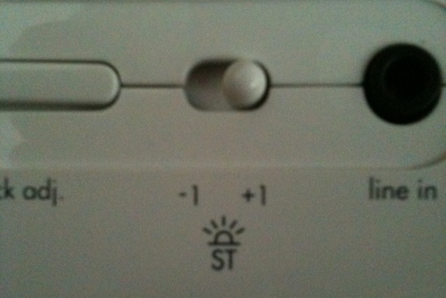
Enter the “DST hardware checkbox” which I found on an alarm clock radio. Thanks to this switch, adjusting the clock for daylight saving time (almost) becomes a no-brainer.

The switch is mounted on the back of the device, but is still easy to find, and the label is big enough to read. In fact, thanks to its location, it does not add any clutter to the UI elements on the front panel that users access much more often.

The switch could be made even more user-friendly by making its labels more meaningful. Unless you read the clock’s manual or just try out what that switch does, the “ST” label and the little “sun-rise/-set” icon may be a tad cryptic. Also, the settings “-1” and “+1” feel odd to any math-savvy technophile.

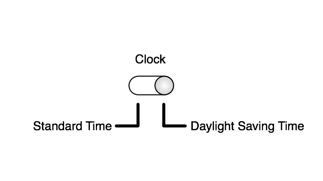
While replacing the “-1” with a “0” and the “+1” with “+1h” could be a small step in the right direction, why not go ahead and label the switch like this:

This would also provide a kind of “built-in documentation” for all of those people who, every time “ST” turns to “DST” or vice versa, have a hard time figuring out whether to set the clock forward or back by an hour.

Update 2010-11-19: Via email, Scott McIntyre pointed out a problem with the DST switch:

The tricky bit with the DST switch is that a naive user will just set the clock for the first time without regard to whether the switch is in the right position, since it doesn’t need to be set in the right position to get the clock to show the right time. So when DST time change comes around, the switch will either work magically (woo!), or will set the time the wrong way and be useless.

In that case, I would expect that the user has tried to make sense of how the device works by deducing the controls functions from their labels and/or by playing around with them. Had she read the documentation, she would have learned how to use the DST switch while following the setup process for the alarm clock (assuming that the documentation would explain the switch as part of the “getting started” instructions, that is).

It would make for an interesting usability test to analyze this kind of discovery process: ask people who are not familiar with the device to compile a list of its features, and explain how these features are accessed and operated — without letting them read the device’s documentation.

What happens when they come across a control whose function they cannot deduct from the control’s label: will they play around with it until they find out; will they eventually want to resort to the manual; or will they choose to ignore it altogether? And in case of the latter, will they go back to such a previously-ignored control later on to find out what it does, after all?

In a way, this goes back to two key usability concepts: “visibility” and “speaking the user’s language.”

A device that clearly communicates its feature set to the user through highly visible, clearly labeled controls, makes it much easier for the user to gauge the features’ importance, and decide which of them to use, and which to (consciously) ignore.

In that sense, a user who immediately understands that a particular control is used to switch between “standard time” and “daylight saving time” by just looking at the very switch itself, will either know what to do with that switch, or skip it. In which case I would expect them to ignore it in the future as well.

What’s more, a user who does use that switch in the scenario that Scott describes, would need to “grok” it just once, namely when incorrectly ”adjusting” the clock for DST by throwing that switch. When that happens, it takes a one-time correction of the device’s clock to ensure that it will work in the future.


  1. For a related topic, see my article “What Time is Your Zone?” about selecting a computer’s time zone under Mac OS X, Ubuntu Linux, and Windows.