A Red Ribbon to Your … Mounting Hardware?

People who love books also tend to love book shelves. And, man, do I love books.

Consequently, I occasionally install new shelves when I run out of space after a few too many I-hope-I-find-the-time-to-actually-read-all-of-these book purchases.

Some of the books on my shelves, showing titles related to cognitive psychology and creativity

The packaging of my favorite shelves sports a nifty feature: Before you even open the carton, you will notice a “very red” ribbon at one of the carton’s short sides. The ribbon’s end is being held in place by a prominent label that says, “Hardware Enclosed.”

The large carton containing the shelves' parts. The red ribbon is clearly visible on the cardboard.

There’s treasure at the end of the ribbon

When you follow the ribbon while unpacking the carton, it will lead you to a little cardboard box. That box contains all the hardware required to assemble the shelves.

The small, red cardboard box is attached to packaging elements inside the large carton. The red ribbon attaches to that small box.

The box contains two plastic bags, one of which is marked, “Spare.” To properly assemble the shelves, you need to use all of the items that are contained in the other, non-spare plastic bag.

So if you find any left-over screws, nuts, etc. after you complete the assembly, you don’t have to wonder whether these are spares, or whether you made a mistake: Since all spares are in the “Spares” bag, finding any unused mounting hardware always unambiguously means that you screwed up somewhere along the process.

Two plastic bags contain numerous mounting hardware parts like screws, etc. These bags are contained in the small, red cardboard box that the ribbon is attached to.

The hardware box is stashed deep inside the shipping carton between all the larger wooden parts and numerous styrofoam filler boards. Including the red ribbon as a guide to that box effectively prevents the user from accidentally overlooking the box and possibly throwing it out with the bigger carton.

User Experience relates to all aspects of the product, however mundane they may seem

Considering this unusual eye for (packaging) detail, it fits into the overall picture that the shelves’ assembly guide is very well-written too, and that the assembly process is very straight-forward as well.

Even with something as simple as a bookshelf you can easily tell whether its designers understand how to create a great user experience, or not. If they do, you will see it in the entire product, and not just in a few details.

LaunchBar Gains a Better Way for Enforcing an App Restart

When you change an application’s settings, you sometimes have to restart the app before the change will take effect. I previously examined five ways of requesting such a restart.

For one of the apps featured in that article, the developers have noticeably improved this process — by implementing just two changes in the User Interface.

The problem of letting the user defer an application restart

LaunchBar is an “application launcher” utility. As such, it is constantly running in the background, waiting for user input.

The setting that requires the restart, is for hiding the app’s Dock icon. Without LaunchBar’s icon constantly showing in the Mac’s Dock and Application Switcher, navigating between all other running programs is easier and quicker.

Previously, you had to click a button labeled “Hide Dock Icon…” in LaunchBar’s preferences panel. This would summon a dialog box that lists all the consequences of hiding the icon. At this point in the process, you could cancel the change, or confirm it, in which case you’d see another dialog box requesting a restart of the app.

This latter dialog also allowed you to defer the restart, however, which led to a number of weird problems. The most obvious of these being that the button label would already change to “Show Dock Icon”, even though the icon had not actually been hidden yet.

Out with the button, in with a checkbox

In the current version of LaunchBar, the “Hide/Show Dock Icon” button has been replaced with a “Show Dock Icon” checkbox.

LaunchBar's Advanced preferences panel with Show Dock Icon checkbox.

As soon as you change the setting, the same elaborate warning message appears. But instead of just showing an “OK” button for dismissing the dialog box, the default button says “Restart Now”.

Dialog box with warnings about consequences of hiding the Dock icon. The dialog's buttons are labeled Cancel and Restart Now.

The separate dialog box for restarting the application is gone. More importantly, though, you cannot defer the application restart anymore: If you click “Cancel”, the dialog box closes, and the state of the checkbox instantly reverts back to checked. As a result, and unlike the button of the previous design, the checkbox will always properly reflect the app icon’s current hidden/visible status.

If you click the checkbox when LaunchBar’s Dock icon is hidden, the icon instantly appears in the Dock and the Application Switcher without requiring any further user interaction.

Small changes, big usability impact

By changing a single UI control, and consolidating two modal dialog boxes into one, the LaunchBar developers have created a much cleaner, more reliable process for restarting their application.

A Pat on the Back for Skeuomorphs

In a recent interview, the interviewer commented thusly:

With iOS 7, Apple finally dismisses that infamous skeuomorphism.1

That’s a typical, and typically hostile, view of skeuomorphism, and it makes you wonder why people generally feel so strongly against them.

Skeuomorphism is more than aesthetics

Most of the countless blog posts and articles about skeuomorphism seem to focus on the use of “rich Corinthian leather”, faux green felt, and fake wood in Apple’s iOS.

While that particular view on the topic may, indeed, warrant discussion, skeuomorphism in user interface design is not (just) about visual aesthetics.

Rather, it’s about designing controls that resemble those from older technology in terms of appearance and behavior, even if, technically, that specific design approach is not necessary anymore.

By tying into a user’s experience and familiarity with using older technology, newer technology can be more accessible and easier to use.

Here’s the more terse definition Wikipedia has to offer:

A skeuomorph is a derivative object that retains ornamental design cues to a structure that were necessary in the original.

For a user experience design point-of-view, let me add one word for clarity:

A skeuomorph is a derivative object that retains ornamental design cues to a structure that were functionally necessary in the original.

An example for skeuomorphism is the button layout of most calculator apps. Technically, a calculator app could accept entire free-form mathematical equations. Nevertheless, most such apps offer the familiar button panel with buttons for digits, operations, the equals sign, etc.

My favorite example for a skeuomorph is entirely non-digital: door lock pins in cars.

A real-world skeuomorphism: Door lock pins in cars

For a few decades, locking pins were the standard control for locking and unlocking a car door.

These pins would stick out vertically from the doors’ inside “window sills”. Pulling a pin upwards would unlock the door; pushing it in would lock them.

A quick aside: Why car door lock pins were positioned where they were positioned

On the front doors, the lock pins were positioned towards the rear of the door; on rear doors towards the front. These mounting positions were not dictated by the location of the door locks themselves, but followed ergonomic considerations.

To this day, most cars only have outside key slots in the front doors. So, to unlock the rear doors in a car that does not have electric locks, you would unlock a front door, reach around the car’s “B” pillar on the inside, and reach for the rear door’s lock pin. If the pin would have been located towards the rear of the door, you would not have been able to reach it that way.

A welcome side effect: Lock pin position maps door locking status

Besides “affording” the actual locking and unlocking operation, the functional design of the door lock pins provided a built-in status indicator. Pin is pushed in: door is locked. Pin sticks out: door is unlocked.

Want to check whether you properly locked the car? A quick glance at the lock pins through a car window is enough to find out.

From fundamental functional control to pure status indicator

The skeuomorphic angle to this story?

Most cars these days come equipped with electric door locks, which can be conveniently unlocked from a wireless remote. Therefore, there is no more need to use door lock pins.

And yet, some cars still provide door lock indicators in the same position of, and with the same appearance as, the now-unnecessary lock pins.

Here is an example from a BMW E46 3 series, showing the front door’s pin in the “unlocked” position.

Inside view of a car's front door with lock pin sticking out from the top of the inside door cover.

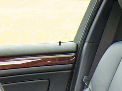
The pin’s only purpose is to reflect the door’s locked status. You cannot push it in to lock the door, and if the door is locked, the pin is recessed completely, so that it sits flush with its bevel. You literally cannot grab it, so that you cannot use it to unlock the door either.2

The button that actually operates the door locks in this car is located in the center console near the gear shifter. It’s far away from the doors, yet much easier to reach for both driver and co-pilot than the (now “fake”) door lock pins.

Just like metaphors, skeuomorphs are about transferring usage experience from one realm to another

BMW’s designers could have come up with a completely novel, totally original visual indicator. For example, they could have grouped four control lights together — one for each door — and placed them at the top of the center console.

These indicators would still be visible through the windows from outside the car. It would also be easier to check them for the people inside the car, because they would not have to turn their heads as they do for checking the “lock pins”.

Nevertheless, someone decided to give the “new” indicators the same visual appearance and mounting location “that were necessary in the original“. Even though they were not technically necessary anymore for the new, electrically operated door locks.

Here’s an important detail, though: Check out the position of the rear (“fake”) lock pin.

Inside view of a car's rear door with lock pin sticking out from the top of the inside door cover.

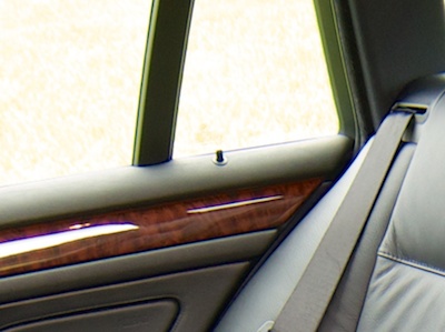
Now that there is no more need to actually reach the pins from the front seats, they have been moved to the rear of the door. However, the appearance and vertical position, i.e., the “design cues” of this “derivative object” are still identical to the “original”.

Dismiss skeuomorphism? At your own peril.

Like so many other UI design techniques, skeuomorphism is just another useful tool in a designer’s tool belt. Applied deliberately and in well-defined doses, it may be just what is needed to make a certain aspect of a system’s UI more user-friendly.

Outrightly dismissing any such tool as soon as a new contrarian design fashion comes along (“flat design”, anyone?), says more about a commenter’s narrow-mindedness than the tools’ inherent merits.


  1. “Mit iOS 7 verabschiedet sich Apple endlich vom berüchtigten Skeuomorphismus”, Felix Disselhoff in M – Das Magazin 

  2. For the Donald Norman fans among you: Yes, the pins do “afford” pushing, but they are “locked” into their position, so you cannot physically pushed them down into the “locked” position. (No puns intended, yet fully acknowledged.)