Five Ways to Request an Application Restart

Sometimes when you modify a preference setting in a software application, a restart is required for the change to take effect.

Such settings used to be accompanied by a line of text, stating that “Changes to this option won’t take effect until you relaunch the application”.

Nowadays, applications are more helpful in reminding you of a required restart, or even take care of that for you.

To give you a few examples for how developers address this process, here is a look at five Mac OS X applications that require a restart when you show or hide their icon in the Dock or menu bar.

Growl: Do what I say (if you know what that is)!

After changing the icon setting in Growl, a dialog box informs you that the application “must restart for this change to take effect”.

Dialog box displayed in front of Growl's preferences window, and stating that a restart is required for a settings change to take effect

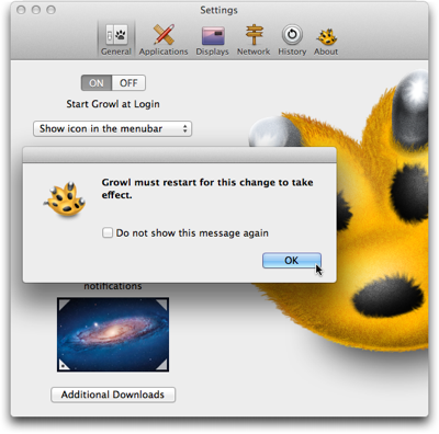
When I saw this dialog box for the first time, I expected the application to restart once I would click the OK button. I found that idea irritating, because I thought, “What if I don’t want to restart the app now? Where’s the Cancel button? Why can’t I back out of this?”

And then I did click OK — and wondered whether the program was buggy, because nothing happened.

It took me a while to understand that this dialog box is purely informational. It does not serve as a warning that the app would actually restart as soon as you click OK.

I would find it helpful if the dialog box expressly prompted you to initiate that restart, e.g., by adding something like “Please quit and restart Growl when you’re done adjusting the settings”.

Better yet, provide a Restart button right inside the dialog box.

Mouseposé: Would you like to restart now, or wait a while?

The “Relaunch required” dialog box in Mouseposé does include a Restart button. A button labeled Later lets you defer the relaunch.

Dialog box displayed in front of Mouseposé's preferences window, and stating that a restart is required for a settings change to take effect

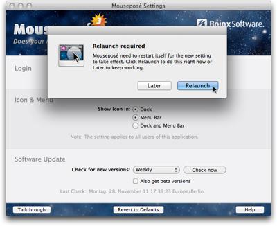
If you do click Later, the change you made to the Show Icon radio buttons is retained, even though the corresponding changes have not been applied to the application’s behavior.

For example, when you change the setting from “Dock and Menu Bar” to “Menu Bar”, and click “Later” in the dialog box, the icon is still shown in both locations.

I see two problems in this behavior.

First, you cannot rely on the preferences displaying the application’s actual settings — i.e., how it behaves right now —, nor can you easily go back to the previous settings.

Second, once you’ve deferred the relaunch and worked with the application for a while, you may forget about having changed any settings. If you then relaunch the application, its changed behavior may come as a surprise and confuse you.

Skitch: Lemme take care of that for you

Skitch‘s icon options are similar to Mouseposé’s. Instead of bringing up a dialog box and allowing the user to defer the relaunch, however, Skitch completely automates the process.

https://uiobservatory.com/media/2011/AutoRelaunchSkitch.png” alt=”Skitch preferences window with a note underneath the “show icon in” option, explaining that the application will automatically restart after a settings change if that is required” border=”0″ width=”400″ height=”302″ />

As it says in the info text underneath the radio buttons, Skitch will simply relaunch if the settings change requires it. The user does not have to do anything, except wait for the application to restart.

Tell me where I can find you

The icon options in Skitch and in Mouseposé have something important in common: You cannot hide both Dock and menu bar icons at the same time. The application will always appear in at least one of these two locations.

Other programs support being turned into background-only applications that are completely hidden from the user’s view. Usually the only means to summon these applications is a keyboard shortcut.

TextExpander: Restart now, or else …

TextExpander is one such application that can hide from the user.

When you select the “Hide TextExpander icon in Dock” option, a warning dialog box will not only inform you that a relaunch is required. It also recommends you define a keyboard shortcut and/or activate the software’s menu bar icon so that you can easily access the application after the relaunch.

Dialog sheet explaining that TextExpander needs to be restarted for a settings change to take effect

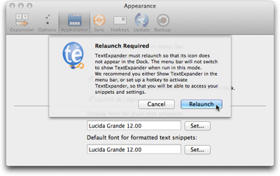
Unlike the previously mentioned software programs, TextExpander does not allow deferring the restart. If you choose Cancel, TextExpander clears the option’s checkmark you had just set.

A detail that I found mildly irritating about this dialog box is that its text message always stays the same, regardless of whether a keyboard shortcut has been set or whether the menu bar icon is visible.

I wish the application would provide a bit more guidance to the user by reflecting these settings. E.g., if a keyboard shortcut is set, the dialog box could remind the user accordingly: “To open TextExpander, press Command-Alt-Control-T. You can modify this keyboard shortcut in the Hotkeys preferences panel.”

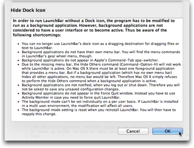
LaunchBar: Treacherous toggle button at work

In LaunchBar, you can only show/hide the Dock icon, because the application does not have a regular menu bar to begin with. Instead of a checkbox for this option, LaunchBar uses a toggle button.

I’ve written about potential problems with “treacherous” toggle buttons before, and the one in LaunchBar has similar issues.

LaunchBar's Advanced preferences panel featuring a button to 'Hide Dock Icon…'

When you click the button “Hide Dock Icon…”, an elaborate message will point out to you what side effects this setting will have.

Dialog sheet in LaunchBar with a long bulleted list outlining the effects that hiding the application's icon from the dock will have

When the button says “Show Dock Icon…” while you click it, this message does not appear. A relaunch reminder appears after every single click on the button.

LaunchBar's dialog sheet to inform the user that a restart of the application is required

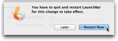
The label on the “Hide/Show Dock Icon…” button will change if you defer the restart, so that it can get out of sync with the actual application’s behavior, just like the settings controls in Mouseposé.

What’s more, when you click Later in the relaunch warning dialog and then repeatedly click the “Hide/Show Dock Icon…” button, the bulleted warning list will show up every time you click “Hide …”.

In contrast, the restart warning never appears again until you actually do quit the and then restart LaunchBar.

A personal opinion

Changing the icon settings in Mouseposé and Skitch is risk-free: You will always be able to “find” either application, because they do not allow you to hide both Dock and menu bar icons at the same time. Consequently, there is no need for a warning beyond requesting the relaunch.

In cases such as these, I like Skitch’s approach of simply restarting itself as necessary, as it does not require any decision making from the user. It just takes care of what needs to be taken care of. “Let the machine do the work for you.”

If there is a risk involved in the settings change — like the application becoming “invisible”, etc. — a confirmation dialog is required.

For these, I prefer TextExpander’s approach of forcing the user to make a decision then and there: Accept the settings change and restart the application, or cancel the restart and discard the settings change.

This is the only way to ensure that what’s displayed in the application’s user interface reflects the actual settings in the application’s guts and, consequently, the software’s behavior.

Pick Your Type of List Selection Wisely

Among the well-established user interface controls are checkboxes and radio buttons for making selections from a list. With “well-established” I mean that users (tend to) have a common understanding of what checkboxes and radio buttons look like, and how they behave.

A preferences panel from Late Night Software's Script Debugger, showing checkboxes and radio buttons to select options

The difference in behavior between checkboxes and radio buttons lies in how many items you can select at a time.

A list of checkboxes allows you to select items arbitrarily: When clicking one checkbox, this has no effect on any other checkbox within the same list. You can check none, some, or all of the items.

Radio buttons, just like their namesake, let you select exactly one item at a time. Clicking on a radio button unselects the previous selection, and there always is an initial selection.1

Interestingly, there is no well-established UI control yet that requires you to select at least one or more list items (vs. zero or more for checkboxes).

In some cases, designers do have to find a workaround for this problem. More often than not, though, there is no actual need for the one-or-more approach to start with. Here’s an example for the latter.

America’s latest premium TV channel: “None of the Above”

Across the US, TV programming differs slightly between regions and providers. Most websites that offer TV listings let you configure their schedule accordingly. On the TV Guide website, for example, you do so by filling out a simple four-step questionnaire.

Form from the TV Guide website for selecting your location and TV provider in four steps

In the final step of this process, you select any premium channels you subscribe to via a list of checkboxes. The odd thing about this design is the bottom-most option: “None of the Above”.

https://uiobservatory.com/media/2011/ListSelectionTVGuide.png” alt=”Fourth step of TV Guide form, showing a checkbox list of premium TV channels plus an option for “None of the Above”” border=”1″ width=”400″ height=”232″ />

Its appearance is perfectly identical to the other list items, which usually means that it should also behave identically, and control the same kind of functionality.

Nevertheless, if you do click this checkbox, any selections you may have made from this list are cleared, so that “None” is the only selection. Un-checking it again, however, does not restore your previous selections.

Because this option visually blends in with the others, it is also easy to overlook. If you do, and make the “mistake” of not checking any of the options, an error message appears, requesting you to “Please select at least one of the options”.

Error dialog box stating to select at least one option from the premium TV channels checkbox list.

Unless you had discovered the “None” option and understood its meaning at this point, seeing those instructions may confuse you: “But I haven’t subscribed to any premium channels. Why, then, should I have to select one?!”

There are several ways to make this process more user-friendly, like making the “None” option stand out visually, by rephrasing the error message to make it easier to understand, etc.

When “None of the Above” should not be an option

The easiest solution in this case, though, is to simply remove the “None” option altogether. Not checking any of the available premium channels already constitutes the common understanding of “Nope, don’t have any of these!”.

Generally speaking, there are cases in which it does make sense to include a “None” option — namely for radio buttons! For checkboxes, however, the status of all checkboxes being unchecked perfectly covers the “None of these” option already.


  1. No matter how many web designers very obviously think otherwise, displaying a group of radio buttons without any selection is bad design. By definition, a radio button has an initial selection.

    If there is none, you have to guess whether whether you are expected to make a selection, or whether it is OK to leave it as is. Also, you cannot easily revert the radio buttons to their initial indeterminate state.

    The easy fix for an indeterminate group of radio buttons is to add another option labeled “None [of these]”, and select this as the default. 

A Bit of TLC for an Online Concert Schedule

One of the biggest festivals on Northern Colorado’s lively music scene is Bohemian Nights, which takes place during the New West Fest in Fort Collins. Kicking off tonight2, this year’s event boasts 80 bands. A customizable concert schedule lets you pick and choose from this sonic abundance.

Here’s what I would consider a common scenario for using such a schedule: After deciding when you are free to attend the festival, you search (or filter) the schedule for all bands who will be playing while you’re there, and whose music appeals to you. You then make your selection from the resulting list.

Let’s see how easy it is to accomplish this on the Bohemian Nights website.3

Finding concert details

The schedule’s default view is a chronological list, grouped by day and start time.

Immediately visible are only the bands’ names. These are displayed against a colored rectangle to indicate their music’s genres. A list on the right shows what color corresponds to what genre (referred to on the site as “[music] types”).

BNSchedule

For a better overview over the schedule, you can also view the concerts on a grid. In this case, though, you can only see one day’s schedule at a time, and depending on its length, the view may be paginated as well.

BNScheduleGrid

Complete information — comprising genre, date and time, venue, and a short info blurb — is available for each concert. You can view this information in three ways: hover your mouse pointer over a band name to make a tooltip-like overlay appear; …

BNScheduleDetailTooltip

… click on a band to show the information on a separate page; …

BNScheduleDetailPage

… or click on Show Details above the schedule to display information as in-line boxes on the schedule.

BNScheduleDetailBox

Obviously, it is rather tedious to “manually” scan all 80, or so, entries on the schedule to find interesting bands, regardless of which of these three methods you use to view the detailed information.

Equally tedious is the attempt to correlate a band’s color with the genre list. With a total of 35 genres, many of which share highly similar, if not identical colors, the limitations in your eyes’ ability to differentiate between these colors will soon become apparent.

What’s more, many bands are listed under more than one genre, but the color only reflects one of these.

BNScheduleGenreList

A much easier approach to work along the usage scenario would be to filter the schedule, so that it would only list those events that match the search criteria.

Add some music to your day

Although this is not directly apparent, you can, indeed, filter the schedule by genre by clicking on any of the genres in the list, but you cannot select more than one genre at a time.

BNScheduleFiltered

To “reset” this filter, you need to click on “Full Schedule”, which is placed far away from the genre list. Finding this function would be easier if it were implemented as an All Genres option and grouped together with the other genre “selectors”.

What the genre list does include are two items called Most Popular and Venues that are not genres at all.

By (most) popular request

Most Popular ranks performers based on the number of people who signified via the schedule’s social features, that they are “interested” in a particular band.

Note how the genre list does contain an All Types item here. That is because clicking any genre in this view will display the rankings within that genre, and All Types takes you back to the full ranking.

BNScheduleMostPopular

In addition to filtering by genre, you can also filter the rankings by day, but you can only select one day (or All Days) at a time. What’s more, although they have their own group and are not placed close to the genres, clicking any of the Popular by Day filters also resets the genre filter!

That is, you can see the ranking for a certain genre (or All Types) or a certain day (or All Days); you cannot filter by genre as well as day at the same time, though.

Where did those guys play again?

The Venues view looks similar to the regular schedule, but it groups the concerts by venue. Through a Venues filter section, you can limit the display to show only bands playing on a certain stage.

BNScheduleVenue

If you click on a genre in this view, you are immediately taken back to the regular schedule for that genre instead of viewing the genre grouped by venue.

Take me back where I belong

If you’re in either Most Popular or Venues view, the link to get back to the “normal” schedule view is not atop the schedule where it was when filtering the list by genre. Instead, the link to click is the header-like Schedule line above People Directory in the column on the right.

Although the Schedule link is highlighted when you’re viewing the schedule, it was difficult for me to find. It just feels illogical to have to use links in two different locations to get to the same page on the site.

Tidying up just a lil’ bit

The extensive information that is made accessible via this schedule is great for planning a visit to Bohemian Nights, but the navigation of the schedule is confusing.

The key reason, in my opinion, is that the site’s information architecture does not reflect the underlying data structures very well.

In essence, there are four different views on the available data:

  1. Concert list: Grouped by date. Sorted by date and time. Filtered by genre.

  2. Concert grid: Grouped by date and venue. Sorted by date and time. (Cannot be filtered.)

  3. Venue list: Grouped by date and venue. Sorted by date, venue, and time. Filtered by venue.

  4. Most popular: Ungrouped. Sorted by popularity. Filtered by genre or date.

In all cases, filtering determines what data is being displayed, and grouping and sorting determine how the data is displayed. To make it easier to grasp this structure, the views should be separated from the filters, and this separation should also be reflected in the UI.

Based on this approach, here’s a suggestion for a slightly different layout4 for this page:

BNScheduleRedesign

Venues and Most Popular are part of a view selection that also includes the default List view plus its Grid variation. All filter groups are always displayed in the column on the right. Instead of being links which only allow single selections, they provide checkboxes for multiple selections, and each filter operates independently from the others.

This design would not only provide more powerful filtering, but also arrange all UI elements in a consistent, logically grouped layout.


  1. Friday, 12 August 2011. 

  2. This schedule is based on SCHED, which offers “Social Mobile Apps & Calendars For Events”. For this article, I focus on the Bohemian Nights website, so I don’t know what features beyond those used on this site are provided by the SCHED software. 

  3. Consider this a colored wireframe. It’s nowhere near production quality.