Apple’s official strategy for the future of OS X is transferring ideas and designs from iOS, the operating system that powers iPhone, iPad, and iPod touch, to the desktop. Apple’s own FaceTime video chat application1 is a more extreme example. Others are more subtle, like menus that feature the look-and-feel of their iOS counterparts.
Unfortunately, the results often deviate considerably from what Mac users are familiar with.
How menus should behave in OS X
Here’s how standard OS X menus behave:
- A menu is opened when you press the mouse (or trackpad, etc.) button while the pointer hovers over the menu’s title or icon.
- If the mouse pointer hovers over a menu item, that item is highlighted.
- When you release the button over a menu item, that menu item is selected, i.e. settings are toggled or commands triggered, and the menu item flickers shortly for visual feedback.
- Menu items can represent sub-menus. These fold out automatically for as long as the mouse pointer is hovering over the item in the parent menu. Sub-menus have the same look and behavior as top-level menus.
- If you single-click on a menu’s title or icon (i.e., you release the button while the pointer is still over the title or icon), the menu will stay open, so that you can select a menu item or other menu without having to hold down the mouse button. You just move the mouse around, and any menu that you hover over, will open, and any item be highlighted.
To illustrate how iOS-inspired menus differ from this standard behavior, here’s a closer look at a context menu in iTunes 11, the toolbar menus in Safari 6, and the main menu of Dropbox 2.
iTunes 11
In iTunes 11, Apple introduced an iOS-inspired context menu for media tracks.
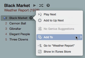
Regular context menus are opened by pressing the secondary button (also known as the “right mouse button”) while the pointer is on the item that the menu belongs to. In contrast, the new context menu is opened by clicking an icon that appears when you hover the mouse pointer over a track.
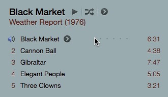
Unfortunately, there is a distinct lag between hovering over a track and the icon appearing. I assume that this is intentional to avoid too much “nervous flicker” on the screen while the user is moving the mouse around. It does feel odd in the context of an operating system, though, in which any similar highlighting instantly follows the pointer.
iTunes 11 — Closing in on the (small click) target
As you can see in the two screenshots above, the context menu’s icon is rather small, and so is the click area. If you miss it, you will select the respective track and reset any selections you may have made before. Conversely, if you intend to click a track to select it, you might open the context menu instead, because you inadvertently click its icon as it gets in the way.
Menus usually appear as soon as you press the mouse button; this menu, though, appears when you release the button, and this is the only available behavior. The menu does not support the more efficient click-move-release, so you must always click twice for making a selection from the menu.
So far, the menu feels a little bit unusual. Once you check out the sub-menu, however, it becomes downright odd.
iTunes 11 — The sub-menu pushes its parent out of the way
To open the sub-menu, you must click on its item in the parent menu, because it does not appear automatically. What’s more, in pure iOS fashion, the sub-menu shoves the parent menu out of the way and, thus, replaces it instead of appearing next to it.
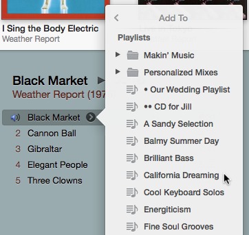
To return to the parent menu, you need to click the “lower than” character in the menu’s top right corner. By hiding the parent menu, you lose information about the context you’re currently in. Therefore, the sub-menu needs a title to remind you of where in the menu structure you are right now.
Such titles do not exist in regular menus, and there is no hover-over or on-click highlighting of the title region either, so you need to play the trial-and-error game: Will clicking the “lower than” character take me back to the parent menu? Is “Add To” just the title of the menu, or is it an active button? If both are buttons, do they have separate functions? What are their respective click areas? Or can I simply click anywhere in the top area to move up one menu level? (Hint: Yes, you can click anywhere in the title area.)
iTunes 11 — Finder-like folders right inside a menu
Another non-Mac-native design feature are Finder-like folders in the sub-menu. When you initially open the context menu, these folders are closed, and you open them by clicking on them. (Kudos to the designers for including standard, always-visible disclosure triangles…)
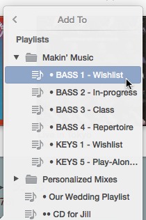
Once you’ve opened (or closed) a folder, it will retain its status — as long as you re-open the context menu on the same track, that is. Because if you open the context menu for another track, all folders will appear closed again!
iTunes 11 — A new menu style with some benefits and yet more drawbacks
The new context menu is a welcome addition to its original sibling which is still available. It is more discoverable thanks to the icon next to a track name. It has fewer items, making it more accessible for less experienced users.
That said, the new menu introduces additional, unusual methods of interacting with a user interface control as fundamental and well-established as a menu. Users need to learn and remember the different behaviors, and know which ones apply to which UI control, which may add unnecessary confusion and cognitive effort.
Experienced users may be alienated by having to interact with their machines in a way that is very different from what they’ve internalized for a long time.
When the new context menu’s sliding design originated on the iPhone, its functionality was born out of necessity: On the much smaller screen, sliding content in and out helps maximize the available screen real estate for actual content that the user needs right then and there.
On the bigger screen of a Mac, that necessity simply does not exist. In this case, it would be much more useful to provide full context by showing parent and sub-menus alongside each other.
As it is now, it feels as though the new context menu in iTunes was designed to show off iOS aesthetics on the Mac, even if it doesn’t make much sense in terms of interaction design.
Worse yet, not preserving the open/close state of the playlist sub-menu’s folders is a fundamental UI design flaw, no matter what you may think of the menu’s aesthetics.
Safari 6
On to Safari. Here’s the program’s toolbar with a number of buttons. 2

Quick question: Which of the five buttons (ignoring the Reader button for now) open menus when you click them?
Answer: All five!
Safari 6 — Single-click for button vs. click-and-hold for menu
Apple’s designers probably omitted the well-established downward triangle that visually indicates a menu control, for aesthetic reasons. That’s a very minor glitch when compared to the fact that these menus differ quite considerably in the way they work.
The two buttons on the left will likely look most familiar to you, as they let you step backwards and forwards in your history. If you hold down the mouse button for a while, a menu with a chronological list of visited sites appears.

This menu is pretty much standard OS X faire with one minor exception: Since a simple click on that button steps through the visited sites, you cannot make the menu stay open after you release the mouse button.
Safari 6 — iOS-style menu with weirdly broken undo
The menu to the right of the two history buttons lists the websites that are currently open on any other iCloud-connected devices you have. This one uses the other method of opening a menu: The list opens when you release the mouse button. Just clicking-and-holding does nothing except highlight the button.

The menu itself is completely non-Mac-native:
- It does not look native,
- there is no highlighting of the item underneath the pointer,
- the pointer is a hand instead of the usual arrow,
- a menu item is only highlighted when it’s clicked, and
- there is no flickering when you select an item.
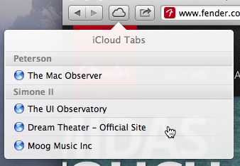
A truly weird aspect of this menu is that you cannot back out of a selection. Once you’ve pressed the mouse button over any of the menu items, you cannot not trigger it.
Yes, you can move the mouse pointer out of the menu before you release the button, but if you do, the most recently selected (i.e., still highlighted) item is loaded into the browser. Pretty strange.
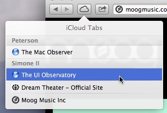
Stranger, still, is that if you move the pointer upwards out of the menu after clicking an item, none of the items will remain highlighted, or selected. And yet, as soon as you release the mouse button outside of the menu, the browser will load the site that you had originally clicked on!
If you’re compiling instructive examples for violations of the “Principle of Least Surprise“, this is an excellent candidate. Do add it to your list now!
Safari 6 — The truly OS X-native menu that is the exception
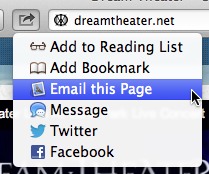
Next up is the share menu, which behaves exactly as it should, i.e., as a completely standard OS X menu as outlined at the top of this article. Not much (new) to see here, so to speak.
Finally, at the right edge of the toolbar, there’s a menu with the list of downloads.
Safari 6 — A formerly standard list window morphed into a non-standard menu
This list used to have its own dedicated window in earlier versions of Safari. Now that it’s a menu tied to a browser window, you need to open such a window for accessing the list. If you hit the respective keyboard shortcut, Safari will open one for you if necessary.
No more stashing that list away in a corner of your screen if all you want to do is monitor a longish download.3
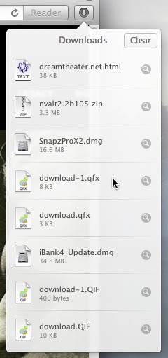
The menu behaves similar to the iCloud menu in terms of how you open it (click-and-release).
Only it doesn’t actually behave like a menu at all. Clicking on an item highlights it, and multiple selections are possible.
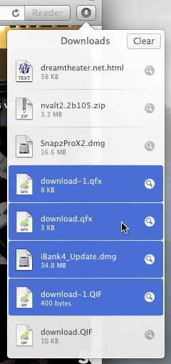
Double-clicking an item or a (possibly multiple) selection, opens the respective files, but you cannot drag the icons out of the menu to, e.g., move the files from their current location to another folder.
Safari 6 — A contextual menu inside a menu. Seriously!
Heck, you can even open a contextual menu inside the downloads menu! Once you open that menu via a secondary click, only the clicked item is being selected, so you can only apply it to one item at a time.
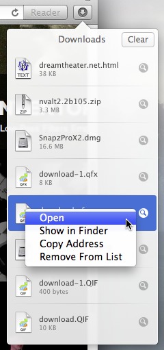
As an aside, I tried moving the downloads menu to another location (via the View > Customize Toolbar… command), but it always “flew” back to its original position at the right edge of the toolbar. No, I have no idea why it does that, or why that makes sense.
Safari 6 — Consistency doesn’t live here anymore
Five menus, three different looks, four different behaviors. And, frankly, the only reason for these design decisions that I can see is to desperately promote the iOS design aesthetic to Mac users.
Safari would not be any less useful or useable if it employed standard OS X menus only, nor if the downloads menu would be moved back to a dedicated window. Quite the opposite, in fact: Safari would most certainly be more usable that way.
Dropbox 2
Dropbox 2 is an example for third-party software whose designers have adopted the iOS design aesthetic, in this case for the application’s menu item.
This is what it used to look like previously:
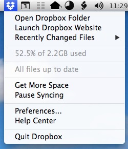
The old design behaved just like a regular OS X menu and didn’t leave its users with too many questions.
This is what the menu looks like now:

It supports both methods to make the menu appear (click-move-release and click-and-immediately-release). If, however, you press-and-hold and then drag the mouse pointer over the menu items, there is no highlighting, and when you release the mouse button, nothing happens. In other words, opening the menu and selecting any of its items always requires two clicks.

Dropbox 2 — An OS X first: menu items side by side
The two main buttons are now arranged next to each other at the menu’s top. This may look fancy, but requires higher motor precision for making the selection than a simple one-column menu.
Also, there is no highlighting when hovering the pointer over either of the two buttons, so it is difficult to guess how far the clickable areas extend.
When clicked, the highlighting is very subtle, and it even persists when moving the mouse pointer outside of the menu. Consequently, you cannot tell whether your command will be canceled, or not.
It will be, but you have to try it out at least once to find out.

Dropbox 2 — Three file items is all you get to see
The menu offers a list of the three most recently changed files in your Dropbox folder. This number of items is fixed, so all you get to see are exactly three files. Since there may be quite a few files in your Dropbox account, chances are that the list changes before you get to select, or share, the file you’re looking for.

The highlighting works fine, though, with the exception that the Share button only appears when you hover over the menu. Which makes it difficult to guess if you can actually click the menu item itself, or whether the available actions are limited to sharing the file (it’s the former). And if you can click the item, what function will it trigger? (It will reveal the file on your Mac)

Dropbox 2 — Same appearance, different functionality (consistency be damned)
If someone has shared files with you, corresponding notifications appear above the list of changed files.

These items do not offer the Share button, which makes sense. But their behavior when you click them also differs from the list of recently changed files.
Instead of opening the file locally in your Dropbox folder, your web browser will come to the front and load the item in the Dropbox web front-end.
The items in the two lists look similar and essentially behave similarly. Why do they trigger different actions, then?
Dropbox 2 — Splitting essential status information between two locations
The original Dropbox menu displayed your total storage space on the Dropbox servers, the percentage used, and the synchronization status as disabled menu items.
The new menu has a status bar at the bottom, but it is now limited to the sync status. Right next to it is a cog wheel, as has become established as the symbol for a Tools or Settings menu. When you click it, you get almost all of the items that were on the menu in its previous design.
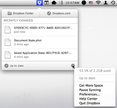
It’s here that you see your storage allowance and percentage used, although there is ample space to provide that information right next to, oder underneath, the new status line. Why hide it this way?
An opinion on applying iOS design patterns to OS X software
Despite the amount of criticism in this article, I do not generally reject the idea of applying iOS design patterns to OS X software. But such transfers must make sense. They must improve the interactions between the user and the operating system.
As it is now, there is still a lot of experimentation going on, and some new approaches will mature into useful, and usable, options for designing details of OS X software.
Nevertheless, the key is that new designs should not violate the usage patterns and behavior expectations that (especially long-time) OS X users have become accustomed to.
More specifically, they should go well beyond boasting visually pleasing new looks. In my humble opinion, it makes little sense to, for example, implement elegant iOS-style animations for flying in a sub-menu — as in the iTunes context menu –, if there is no fundamental need in moving the menus around in the first place.
-
Here’s what I think of FaceTime’s user interface: “Face to Face With FaceTime” covers the public beta of the application, “A Minor Face-Lift for FaceTime” looks at the changes Apple implemented for the release version. ↩
-
I usually have more items on that toolbar, but for this observation I’ve focused on features that are built right into Safari and don’t rely on third-party add-ons. ↩
-
The downloads menu will close if you interact with its parent window, switch to another Safari window, or switch from Safari to another app. Yup, that is pretty crazy, no? ↩